Rate This Board allows a billboard designer to rate a random piece of billboard artwork using the following scale: 1 (not good), 2 (below average), 3 (average), 4 (very good), 5 (great). Then the designer talks about what they may have done differently for outdoor advertising. This week’s rating is provided by Greg Callaham (www.gregcallaham.com) who has 30 years of experience in outdoor advertising design. Insider uses and endorses Callaham’s services.

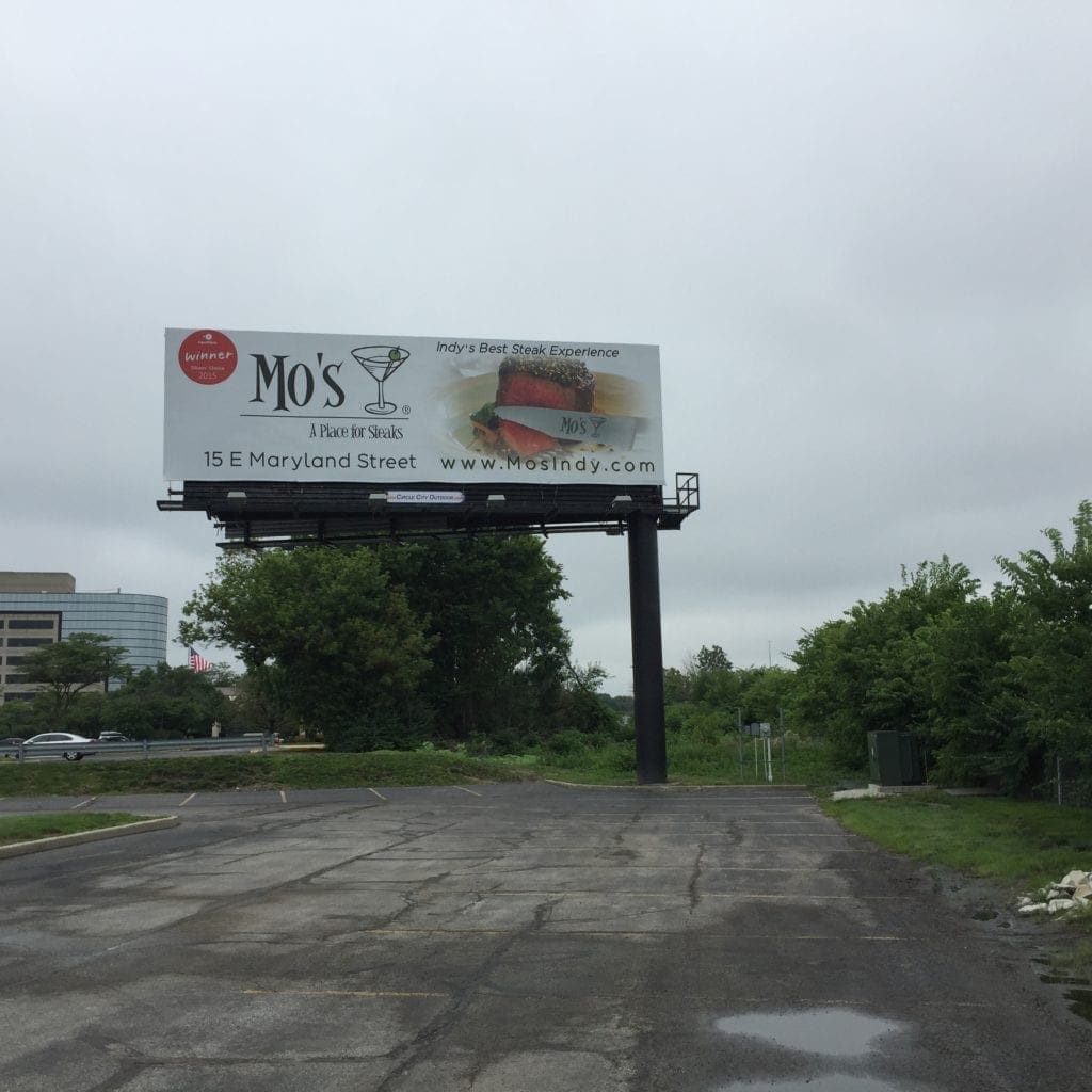
Mo’s Restaurant
Rating: 1 (not good).
- This Mo’s Something-I-Can’t-Read board is hampered by an anorexic logo and equally thin fonts.
- Perhaps the advertiser wanted to impart an air of sophistication, and thin geometric fonts certainly do that, but not in outdoor advertising.
- The dark text running across the photo losses contrast, making it even less readable.
- The red circle in the upper left might be a special offer, but the audience cannot read it.
Paid Ad


