Rate This Board allows a billboard designer to rate a random piece of billboard artwork using the following scale: 1 (not good), 2 (below average), 3 (average), 4 (very good), 5 (great). Then the designer talks about what they may have done differently for outdoor advertising. This weeks rating is provided by Greg Callaham www.gregcallaham.com) who has 30 years of experience in outdoor advertising design. Insider has used and endorses Callaham’s services.

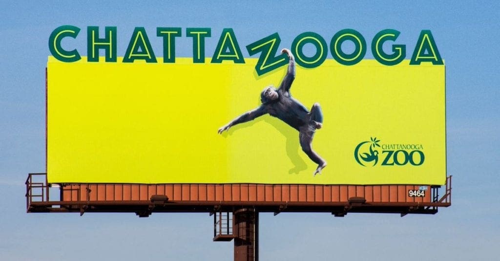
Chattanooga Zoo – Rating 4 (very good)
- Keep It Super Simple. That’s every successful outdoor advertising designer’s mantra and this is an excellent execution.
- What some might call “wasted space” is actually a retina-searing attention-getting device.
- The extensions break up the top edge and do their job making the viewer look and read almost against their will.
- The chimp makes the board memorable with a “cute” factor, turning the “N” into a “Z” to play on the double-O.
- And just as we got to the goal line…the logo got way too small. Fumble! Yes, the word “Chattanooga” is at the top and the word “Zoo” is legible, but only barely. There’s all that room for a larger logo and it should have been used. Perhaps the advertiser made that decision. If so, salesmanship should have changed their mind to maximize the impact and return on the ad expenditure.Field goal instead of a touchdown. This one earns a 4 (very good) instead of a 5 simply because of the logo size.
[wpforms id=”9787″]
Paid Advertisement


