 Rate This Board allows a billboard designer to rate a random piece of billboard artwork using the following scale: 1 (not good), 2 (below average), 3 (average), 4 (very good), 5 (great). Then the designer talks about what they may have done differently for outdoor advertising.
This weeks rating is provided by Melody Roberts. Melody is a billboard designer and founder of Out of Home Creative, an outdoor advertising design firm specializing in creating unique out of home designs for businesses, agencies, media buyers and out of home companies.
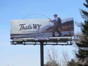
That’s WY
Rating: 4 (Very Good)

There are several design elements in this billboard which I love.
 When an outdoor ad has an extension especially one which emphasizes the subject’s action, you know the designer has done their job right.
- The different fonts used in the headline and the serene imagery are nice too but what sets this billboard apart from the rest is the use of a Heterograph in the short but meaningful tagline. When you look at the billboard you immediately pronounce the phrase in your head but understand that “WY” stands for ‘Why’ and ‘Wyoming’. Even though it’s a simplistic tourism out of home advertisement, it has you thinking of this double meaning.
- I would have considered moving the headline and website up and to the left, making the website bigger and bolder. Yes, this would mean the fishing line could be covered up but that would be off-set by the extension which makes it clear what is happening in the ad. I understand tourism boards can get away with the bare minimum but in the end, if the client requested a call to action it should be readable.
- From what I can tell in the photo, I assume this billboard is located next to an interstate and with its color scheme it may take a few drive-byes to make out all the message components. Who’s ready to go fly fishing?
Paid Ad


 When an outdoor ad has an extension especially one which emphasizes the subject’s action, you know the designer has done their job right.