Rate This Ad allows a billboard designer to rate a random piece of billboard artwork using the following scale: 1 (not good), 2 (below average), 3 (average), 4 (very good), 5 (great). Then the designer talks about what they may have done differently for outdoor advertising. This week’s rating is provided by Greg Callaham www.gregcallaham.com) who has 30 years of experience in outdoor advertising design. Insider has used and endorses Callaham’s services.
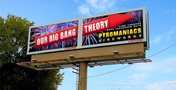
Our Big Bang Theory
Rating: 3 (average)
- This outdoor ad for a fireworks store does a good job of drawing attention and makes a clever play on words to ride the coattails of a popular sit-com.
- The visual spans both faces of a side-by-side structure, turning the two ad spaces into one.
- The name of the store is large, high contrast, and easy to read. It works well as an awareness message.
- Unfortunately, someone tried to make it do double duty as a directional. That didn’t work. The directional text is far too small to be informative to anyone except the installation crew.
- I’m also concerned about the use of the Facebook logo as the first letter in the word “fireworks.” Not only is that more difficult to read, it could be a violation of the terms of use for the Facebook logo.
- This ad earns a 3 (average).
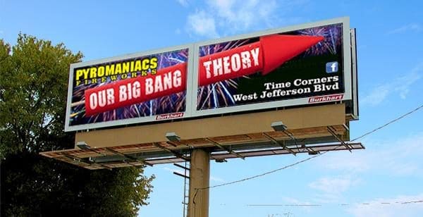
While I do not know the specific messaging goals and design parameters for this ad, I would have repositioned some elements for better flow to tie the two faces together even more and to significantly increase legibility, especially for the directional, something like the mock-up below:
[wpforms id=”9787″]
Paid Advertisement