Rate This Ad allows a billboard designer to rate a random piece of billboard artwork using the following scale: 1 (not good), 2 (below average), 3 (average), 4 (very good), 5 (great). Then the designer talks about what they may have done differently for outdoor advertising. This week’s rating is provided by Greg Callaham who has over 30 years of experience in outdoor advertising design. Insider has used and endorses Callaham’s services.
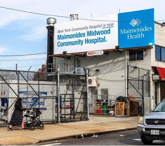
Maimonides Midwood Community Hospital
Rating: 3 (average)
- The ad picture above is a basic text-only billboard announcing a hospital name change. It uses color blocks to separate important information.
- The previous business name is small and presented in a medium gray with the new name in large bright blue letters.
- The new logo is reversed out of the same blue to plant the seeds of the new corporate identity in the minds of the target audience.
- Everything except the old business name has good contrast for legibility.
- There’s no grab-you-by-the-retinas visual to make one look at the ad, but if one does happen to see it, the ad communicates the intended message. This ad earns a 3 (average).
[wpforms id=”9787″]
Paid Advertisement