Rate This Ad allows a billboard designer to rate a random piece of billboard artwork using the following scale: 1 (not good), 2 (below average), 3 (average), 4 (very good), 5 (great). Then the designer talks about what they may have done differently for outdoor advertising. This week’s rating is provided by Wes Frick of Wes Frick Design Agency.
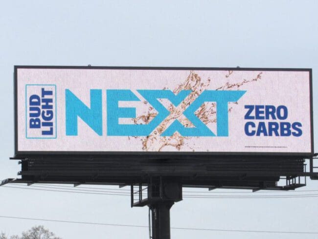
Zero Carbs
Rating: 3 (average)
• This billboard is easy to read, and the colors are on-brand.
• The billboard design doesn’t evoke an emotion or make me want to drink Bud Light Next.
• A full white background on a billboard actually turns out really dark, off-white. It would be better if they had that Bud Light dark blue on the background instead with white font.
Here’s the ad I’d do.
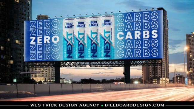
- The design above shows the Zero Carbs part of the beer which is the biggest selling point much more clearly. I featured a group of four bud lights because their brand usually features a group of people drinking together at a party, and a party of four is pretty common and also worked well for this layout.
- I added the Bud Light blue background with some textures using the beer liquid in the background slightly and I also included some other elements to make it grab the eye and make it more fun.
[wpforms id=”9787″]
Paid Advertisement