Rate This Ad allows a billboard designer to rate a random piece of billboard artwork using the following scale: 1 (not good), 2 (below average), 3 (average), 4 (very good), 5 (great). Then the designer talks about what they may have done differently for outdoor advertising. This week’s rating is provided by Wes Frick of Wes Frick Design Agency.

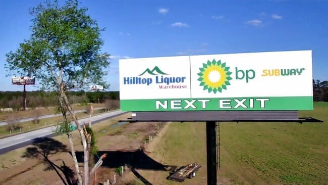
Next Exit
Rating: 3 (average)
This billboard is your typical next exit sign, and I think it could have some improvements to balance out the logo sizes and be more organized for quick legibility. This is what I would do in the situation if I was tasked with designing the next exit sign for this travel center.
• The “Next Exit” font at the bottom looks stretched. I would like for this to be the first thing people would see, so I put it on the left side as we read left to right with a colorful border that you can’t miss.
• Hilltop Liquor Warehouse and BP are able to be seen clearly, but Subway looks a little small. I rebalanced the logo to allow for the two more horizontal logos, (Hilltop Liquor Warehouse and Subway) and placed bp’s more vertical logo to the right to be of a similar height of the other two logos.
• I believe the travel center that this billboard is pointing to would benefit from showing digital gas prices on the right side. These are about $15,000 a piece to order, but BP definitely has the money. As a gas station, most bring in roughly $80-$300k in revenue and it would be of high value to advertise the gas prices digitally as it is a dynamic effect that enhances the quality.
• I added a diamond white background to give the board a little bit of texture and make it look nicer.

[wpforms id=”9787″]
Paid Advertisement


Would love to see the gas and diesel prices back at that rate. Lol.
One can dream.. haha