


Rate This Ad allows a billboard designer to rate a random billboard ad using the following scale: 1 (not good), 2 (below average), 3 (average), 4 (very good), 5 (great). Then the designer talks about what they may have done differently for outdoor advertising. This week’s rating is provided by Wes Frick of Wes Frick Design.
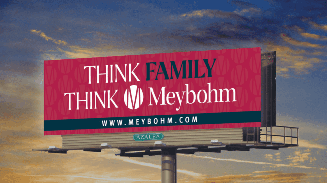
Rating: 3 (average)
- When I first saw the current billboard design, I didn’t know what it was for. “Think Family Think Meybohm” could be anything, like a church, counseling, or something else in that vein.
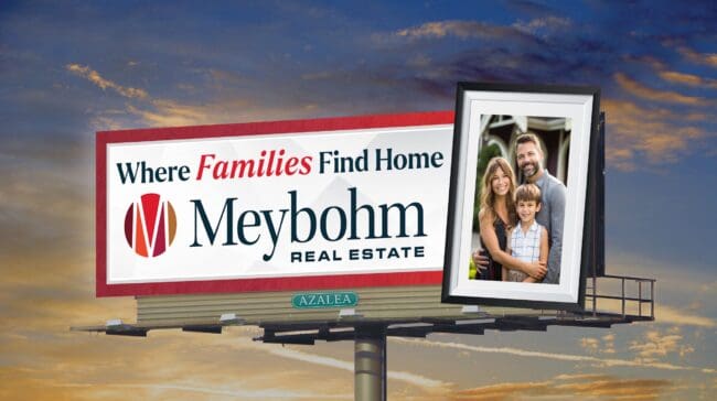
- To clarify what type of business it is, I added the Meybohm Real Estate Logo to make it clear what it is.
- To push it further, I changed the headline to be “Where Families Find Home” with an emphasis on “Families” because it’s more specific about what families get at Meybohm.
- As far as the colors go, I don’t like full red unless it’s a political campaign because it’s an alarming color which can give people unease and subconscious distrust, so I changed it to be mostly white so it could also show the original brand colors and look a bit brighter and cleaner.
- I don’t know if the billboard was digital or static, but if it’s static I always recommend extensions because they improve visibility dramatically, so I added the photo of the family in front of the house in a family portrait because families also want to make memories in their home and so I’m speaking to that subconsciously by using a picture frame as the extension.
To receive a free morning newsletter with each day’s Billboard insider articles email info@billboardinsider.com with the word “Subscribe” in the title. Our newsletter is free and we don’t sell our subscriber list.
Paid Advertisement