Rate This Ad allows a billboard designer to rate a random billboard ad using the following scale: 1 (not good), 2 (below average), 3 (average), 4 (very good), 5 (great). Then the designer talks about what they may have done differently for outdoor advertising. This week’s rating is provided by Wes Frick of Wes Frick Design Agency.
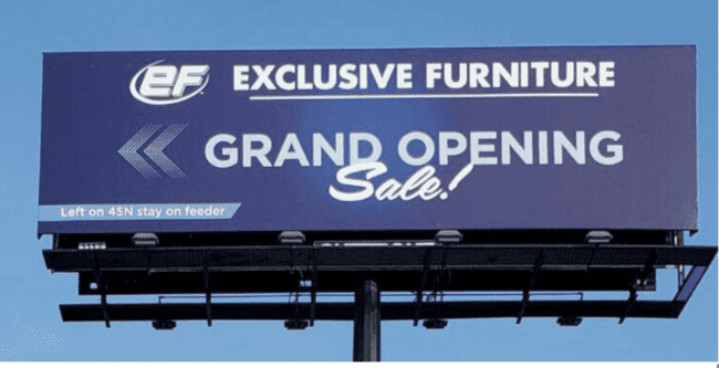
Grand Opening Sale
Rating: 3 (average)
- I like that they are using a blue and white color scheme, I think it looks clean but may be too dark as it looks a little faded. The fonts that they are using are very legible which i appreciate, and I like the arrows as well.
- The directional is pretty small and I don’t really think it’s needed, I’m not familiar with the roads here so I wouldn’t understand it, and it’s just easier to search the name and get a route to check out their furniture. It just saves time and is easy.
- I wish they would have used images of their exclusive furniture – When I think of exclusive furniture I think about nice brown leather furniture sets, etc. Similar to using images for restaurants making people hungry, we should use images of furniture that make us want furniture.
I’ve created a version that uses extensions to the max, while also using lighting on the lamp at night, showing off their furniture, and also showing the target audience enjoying the furniture, making it look exclusive, desirable, etc. I’ve been driving across the country recently and billboards with extensions have been getting my attention and I think for a grand entrance it is so necessary, even if it’s more costly, it’s so worth it to do the extra.

[wpforms id=”9787″]
Paid Advertisement