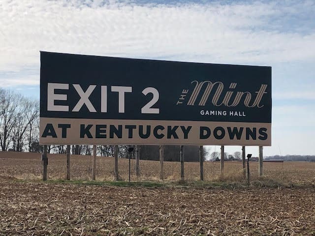
Rate This Ad allows a billboard designer to rate a random piece of billboard artwork using the following scale: 1 (not good), 2 (below average), 3 (average), 4 (very good), 5 (great). Then the designer talks about what they may have done differently for outdoor advertising. This week’s rating is provided by Richard Molinaro, co-owner of Up To Something Agency.

The Mint Gaming Hall
Rating: 2 (below average)
- This ad gets a 2. It doesn’t get a 1, because it obeys the rules of legible out of home—mostly. But that’s where its merits end.
- What is The Mint? For anyone unfamiliar, or with average to above average eyesight, “Gaming Hall” is likely illegible.
- The exit number is huge. This is usually reserved for the most important piece of information. Is it what’s meant to draw me in?
- The location bar at the bottom. It’s been done. To death.
- Overall, it doesn’t make me feel anything. Gambling and more specifically, sport betting—they’re exciting! Where’s the drama?
- This billboard ought to reflect the experience—rather than just straight text.
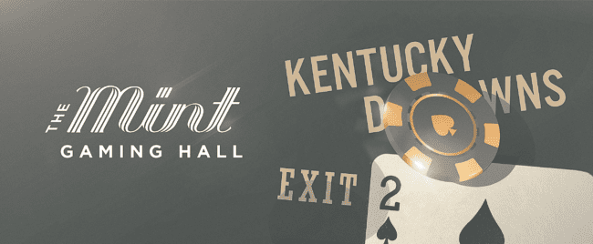
I didn’t see the brief. Based on the information already here, here is how I might improve upon the design.

To receive a free morning newsletter with each day’s Billboard insider articles email info@billboardinsider.com with the word “Subscribe” in the title. Our newsletter is free and we don’t sell our subscriber list.
Paid Advertisement


