Rate This Ad allows a billboard designer to rate a billboard ad using the following scale: 1 (not good), 2 (below average), 3 (average), 4 (very good), 5 (great). Then the designer recommends how to improve the ad. This week’s rating is provided by Melody Roberts, an OBIE nominated billboard designer and founder of Out of Home Creative, an outdoor advertising design firm specializing in out of home design for businesses, agencies, media buyers and out of home companies. Melody has been in the outdoor industry since 1999. Insider uses and endorses her services.
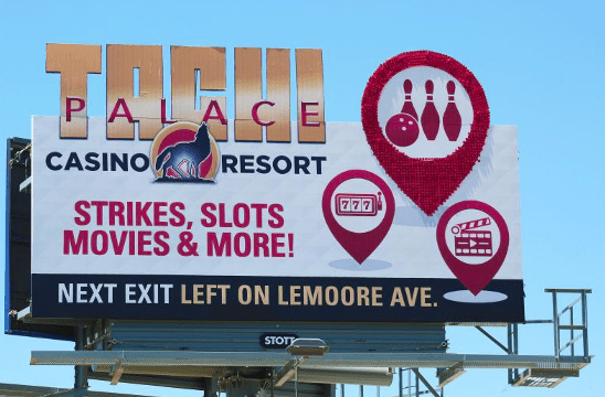
Tachi Palace
Rating 1 (not good)
Please Note: For all ratings, I don’t know if a client insisted on certain elements or how much experience the designer had with out of home advertising. My recommendations requested by Billboard Insider are solely based on how I would have approached the creative design.
I’m curious to know how the readers feel when they look at this advertisement. Did they think they hit the mark, was it too busy, did they love the extensions, were the extensions overpowering the space…?
When I see this overcrowded advertisement, I get frustrated, but I also know I’ve tried to explain to clients that they don’t need everything on a billboard; to consider a more conceptual idea, and they still insist on their direction. Maybe this was the case with this client. That does not mean we stop offering clients assistance when it comes to creativity. Providing clients with more than one concept helps them see a comparison of what they think they want instead of what works for OOH.
Option A: Show your client what they want
Option B: Improve upon their idea for OOH
Option C: Your take on what they’re envisioning but works best for OOH
In my experience, clients usually go with Option C.
Not only is your client’s image and brand at stake, but the outdoor company’s image is too. If we discuss more of a creative, conceptual idea we help our clients understand our medium better and the outcome will be more creative as well.
If you come across a client who may want to do something similar to this remember:
- Negative space is not a negative.Take time to explain to your client(s) that you do not have to fill the entire board with copy and graphics. One graphic or slogan is all you need to build on to grab someone’s attention and hold it. The more space the better the flow and overlook of the Ad.
- People do not need three graphics plus wording to explain what a business offers. Say it or show it, don’t do both.
- Just because a client has the budget for extensions does not mean everything works as an extension. The TACHI logo is a perfect example of this. In my opinion, channel letters don’t read well extending off a billboard but the locator graphic is a nice, solid extension and would have made more of a creative impact as a stand-alone.
With all the above said, here are the design changes I would have made:
- Change the background to Black which would allow the logo to contrast better. I would not extend the logo because I think it’s harder to read that way.
- I would have only used one graphic, seeing what they’re trying to accomplish here I would have chosen a slot machine. That would have been a fun, dimensional piece of art where they could have used the bowling/slots/movie clip art in each of the three slot machine windows.
- I would have discussed printing a reflective gold self-adhesive to make the slot machine shiny or dual lit projecting an illuminating effect at night so the slot graphics would really stand out.
- The text of “Strikes, Slots, Movies and More!” could’ve been left out. Maybe this is their official slogan which is why it was included in the first place.
All these edits would have allowed more space along the bottom to make the directional larger.
[wpforms id=”9787″]
Paid Advertisements