Rate This Ad allows a billboard designer to rate a random piece of billboard artwork using the following scale: 1 (not good), 2 (below average), 3 (average), 4 (very good), 5 (great). Then the designer talks about what they may have done differently for outdoor advertising. This week’s rating is provided by Greg Callaham www.gregcallaham.com) who has over 30 years of experience in outdoor advertising design. Insider has used and endorses Callaham’s services.

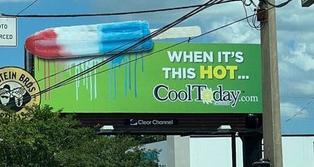
Ad: Cool Today
Rating: 1 (not good)
This is a great ad for popsicles with the large colorful visual and the extensions breaking the long horizontal plane across the top of the board. It really gets the viewer’s attention. Unfortunately, the popsicle has very little, if anything, to do with the advertiser. This ad is actually for an HVAC company. I had to look it up. That is something the target audience probably would not have the luxury of doing while trying to drive or think to do after having their brains sent in the wrong direction by the graphic. They were just told “Have a popsicle when it’s this hot.” Why would their next thought be about their HVAC system? They’re thinking about stopping at the next grocery store to buy popsicles. This ad earns a 1 (not good).
As always, I do not know the details of the art request or components of the campaign this ad may or may not have been part of. But looking at this challenge with the eye of an OOH graphic designer and through the lens of the target audience, I would have urged the advertiser to run the ad pictured below:

The ad above is constructed from elements found on the advertiser’s website, which is very well done. We still have the bright green background to catch the eye, we have the reference to the weather as the problem, and the business name is now directly positioned as the timely solution. It’s also hammered home with its inclusion in the headline and as the contact info.
[wpforms id=”9787″]
Paid Advertisement


