Rate This Ad allows a billboard designer to rate a random piece of billboard artwork using the following scale: 1 (not good), 2 (below average), 3 (average), 4 (very good), 5 (great). Then the designer talks about what they may have done differently for outdoor advertising. This week’s rating is provided by Greg Callaham www.gregcallaham.com) who has 30 years of experience in outdoor advertising design. Insider uses and endorses Callaham’s services.
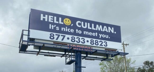
Hello Cullman
Rating: 4 (Very Good)
We all know the mantra for effective outdoor advertising: Keep It Super Simple. This Cullman ad does exactly that.
- A little splash of color draws the eye to a friendly smiley face.
- Crisp, easy-to-read white text against a high-contrast dark blue background helps the target audience read this quickly.
- The same dark blue is used for the phone number against a white background in the precise spot where John Q. Public expects to find contact info.
- A word count of eight gets it all done in less than seven seconds.
It’s not flashy, it’s not super creative, and it’s not going to win an award. But it works! It’s what our medium needs to do first and foremost. That’s how we renew contracts and create long-term customers. This billboard earns a 4 (very good).
[wpforms id=”9787″]
Paid Advertisement