Rate This Ad allows a billboard designer to rate a random piece of billboard artwork using the following scale: 1 (not good), 2 (below average), 3 (average), 4 (very good), 5 (great). Then the designer talks about what they may have done differently for outdoor advertising. This week’s rating is provided by Greg Callaham (www.gregcallaham.com) who has over 30 years of experience in outdoor advertising design. Billboard Insider uses and endorses Callaham’s services.
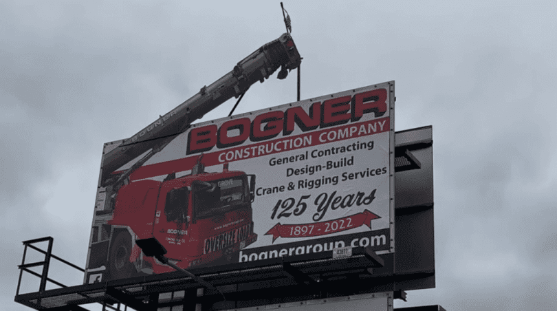
Bogner Construction Company
Rating: 4 (very good)
- You don’t often see extensions on a 12×24-ish billboard, but this extension does exactly what it is supposed to do: make you look. In addition, it reinforces the advertiser’s business and capabilities.
- The large name is a plus, although the red and black together are not as legible as a lot of clients think.
- The web address at the bottom as the last thing the target audience sees is good placement.
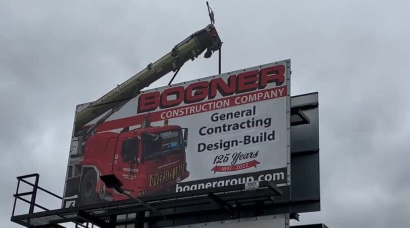
- I would place less emphasis on the 125 Years information and more on the services offered (see below), and delete the “Crane & Rigging Services” text. The photo says that.
- This ad earns a 4 (very good).
To receive a free morning newsletter with each day’s Billboard insider articles email info@billboardinsider.com with the word “Subscribe” in the title. Our newsletter is free and we don’t sell our subscriber list.
Paid Advertisement









The extension is cool but that’s too much copy to rate a 4 IMHO. I give it a 3. The redesign is a definite improvement, but still too much copy for me. I would drop the “125 years” completely. Save that for print and the website. It’s worth losing it to make the rest more readable.