Rate This Ad allows a billboard designer to rate a random piece of billboard artwork using the following scale: 1 (not good), 2 (below average), 3 (average), 4 (very good), 5 (great). Then the designer talks about what they may have done differently for outdoor advertising. This week’s rating is provided by Greg Callaham (www.gregcallaham.com) who has over 30 years of experience in outdoor advertising design. Insider uses and endorses Callaham’s services.
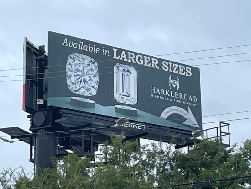
Harkleroad Diamonds
Rating: 3 (average)
- The ad pictured here does a good job of showing the product well. The tag line even has a little fun with the sizes of stones offered by the advertiser.
- While the black and white palette offers good contrast for legibility, the lack of color means the ad lacks some “oomph.”
- The font choice seems a bit dated, but that might be a choice made by the advertiser.
- The arrow in the lower right seems to indicate the billboard is right over the business, so that sort of offsets the inability to read the address.
- I keep wondering what those things are under the diamonds. Perhaps that’s a personal limit to my knowledge of the inner workings of the jewelry industry. However, I think the target audience might have a similar knowledge limit. That means those things become a distraction from the selling message. This ad earns a 3 (average).
To receive a free morning newsletter with each day’s Billboard insider articles email info@billboardinsider.com with the word “Subscribe” in the title. Our newsletter is free and we don’t sell our subscriber list.
