Rate This Ad allows a billboard designer to rate a random piece of billboard artwork using the following scale: 1 (not good), 2 (below average), 3 (average), 4 (very good), 5 (great). Then the designer talks about what they may have done differently for outdoor advertising. This week’s rating is provided by Greg Callaham www.gregcallaham.com) who has over 30 years of experience in outdoor advertising design. Insider has used and endorses Callaham’s services.
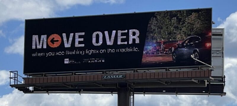
Move Over
Rating: 2 (Below Average)
- This ad is supposed to convey an extremely important safety message that is completely lost due to font size and photo choice.
- The “Move Over” part works well. However, the second line is the part of the message meant to protect first responder and highway workers: “when you see flashing lights on the roadside.”
- Then there are the obligatory state office logos no one ever looks at. The photo is a long shot of a police car and firetruck, but it’s too small and the passenger car in the foreground, supposedly demonstrating the move over maneuver, partially blocks and distracts from the activity in the background.
- I’m sure it works in magazine ads, but not on billboards. This ad earns a 2 (below average).
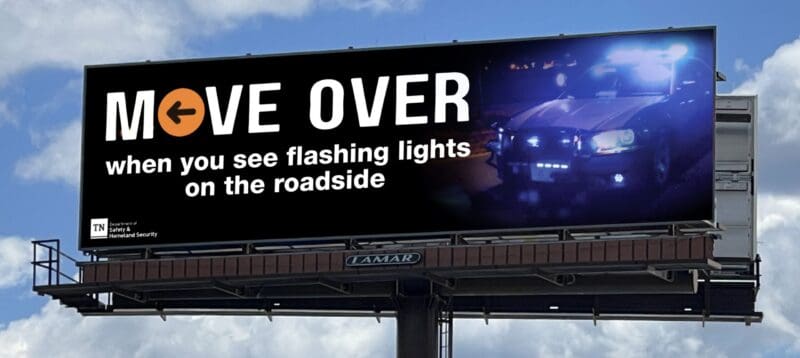
As always, I do not know the details of the art request or components of the campaign this ad may or may not have been part of. But looking at this challenge with the eye of an OOH graphic designer and through the lens of the target audience, I would have urged the advertiser to run the ad pictured below to promote the same message:
To receive a free morning newsletter with each day’s Billboard insider articles email info@billboardinsider.com with the word “Subscribe” in the title. Our newsletter is free and we don’t sell our subscriber list.
Paid Advertisement