Rate This Ad allows a billboard designer to rate a random piece of billboard artwork using the following scale: 1 (not good), 2 (below average), 3 (average), 4 (very good), 5 (great). Then the designer talks about what they may have done differently for outdoor advertising. This week’s rating is provided by Greg Callaham www.gregcallaham.com) who has over 30 years of experience in outdoor advertising design. Insider has used and endorses Callaham’s services.
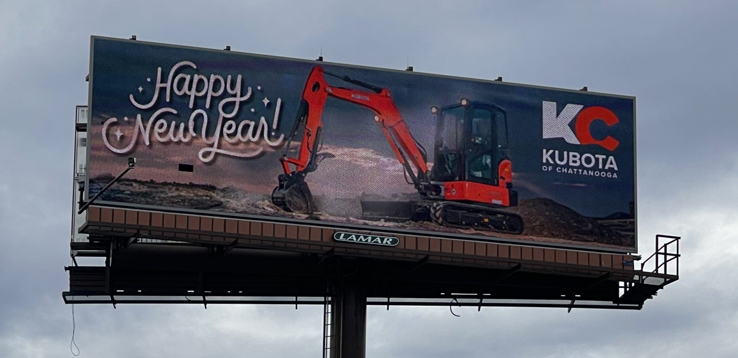
Kubota
Rating: 4 (very good)
- This ad for a Kubota dealer does a good job of presenting the hero shot as an attention-getting device.
- The logo is a decent size so the target audience can have a better than 50/50 chance of seeing it.
- I love the logo design but the business name is too small. I would have made it much larger for the sake of maximum legibility or broken and increased the advertiser’s name to make it easier to read.
- The headline is a bit incongruent with the product and the industry. Something a bit blockier and easier to read would have really done the trick.
- It’s a nice billboard overall. This ad earns a 4 (very good).
To receive a free morning newsletter with each day’s Billboard insider articles email info@billboardinsider.com with the word “Subscribe” in the title. Our newsletter is free and we don’t sell our subscriber list.
Paid Ad
