


Rate This Ad allows a billboard designer to rate a random piece of billboard artwork using the following scale: 1 (not good), 2 (below average), 3 (average), 4 (very good), 5 (great). Then the designer talks about what they may have done differently for outdoor advertising. This week’s rating is provided by Greg Callaham www.gregcallaham.com) who has over 30 years of experience in outdoor advertising design. Insider has used and endorses Callaham’s services.
This is a picture of a digital sign. I was unable to capture the ad with a fast enough shutter speed. I am critiquing the design and format of the ad, not the seemingly poor quality of the picture.
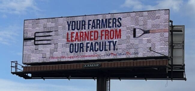
Farmers Learned From Our Faculty
Rating: 1 (Not Good)
- With a ten-word message, this digital awareness ad could have been great. Unfortunately, four of those words are too small to read.
- Since that includes the web address where one would find information to explain what the ad is talking about, the target audience is left wondering why they bothered to read the headline.
- No benefit is explained.
- This ad earns a 1 (not good).
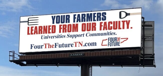
As always, I do not know the details of the art request or components of the campaign this ad may or may not have been part of. But looking at this challenge with the eye of an OOH graphic designer and through the lens of the target audience, I would have urged the advertiser to run the ad pictured below to promote the same message:
To receive a free morning newsletter with each day’s Billboard insider articles email info@billboardinsider.com with the word “Subscribe” in the title. Our newsletter is free and we don’t sell our subscriber list.
Paid Advertisement