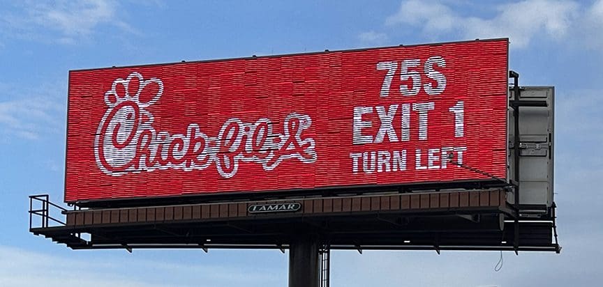
Rate This Ad allows a billboard designer to rate a random piece of billboard artwork using the following scale: 1 (not good), 2 (below average), 3 (average), 4 (very good), 5 (great). Then the designer talks about what they may have done differently for outdoor advertising. This week’s rating is provided by Greg Callaham (www.gregcallaham.com) who has over 30 years of experience in outdoor advertising design. Insider has used and endorses Callaham’s services.

Chick-Fil-A
Rating: 5 (great)
- Aaaahhhh….the perfection that is Chick-Fil-A! And their chicken is pretty good, too! This ad is never going to win an Obie, but it does its job and it does it as well as possible.
- Huge logo and large directional in an simple, sans serif font on a bright red, attention-getting background.
- The target audience sees it easily, reads it quickly, and remembers it. That’s what we’re paid to do, folks. This ad earns a 5 (great).
To receive a free morning newsletter with each day’s Billboard insider articles email info@billboardinsider.com with the word “Subscribe” in the title. Our newsletter is free and we don’t sell our subscriber list.
Paid Advertisement


Definitely a 5!
Simple and to the point…Jesus Chicken at exit 1…Boom!
Ah, simplicity! But the resolution is poor. What is that material? It doesn’t look like vinyl OR digital. It interferes with the clarity of the message.