Rate This Ad allows a billboard designer to rate a random piece of billboard artwork using the following scale: 1 (not good), 2 (below average), 3 (average), 4 (very good), 5 (great). Then the designer talks about what they may have done differently for outdoor advertising. This week’s rating is provided by Greg Callaham www.gregcallaham.com) who has over 30 years of experience in outdoor advertising design. Insider has used and endorses Callaham’s services.

McDonalds
Rating: 5 (great)
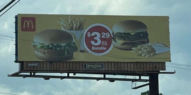
- I’m lovin’ it! This McDonald’s ad shows the target audience a couple of sandwiches and fries with a price point. Simple. Message received.
- The yellow background attracts the eye while visually reinforces the gold of the arches in the logo.
- The hero shots of the products are clear and easily identified.
- The price is unexpectedly centered and positioned in a bright red circle so it cannot be missed.
- The logo is in the upper left, telling the viewer immediately who is communicating to them.
- The designer that created this ad should teach others. This ad earns a 5 (great).
To receive a free morning newsletter with each day’s Billboard insider articles email info@billboardinsider.com with the word “Subscribe” in the title. Our newsletter is free and we don’t sell our subscriber list.
Paid Advertisement


