


Rate This Ad allows a billboard designer to rate a random piece of billboard artwork using the following scale: 1 (not good), 2 (below average), 3 (average), 4 (very good), 5 (great). Then the designer talks about what they may have done differently for outdoor advertising. This week’s rating is provided by Greg Callaham (www.gregcallaham.com) who has over 30 years of experience in outdoor advertising design. Billboard Insider uses and endorses Callaham’s services.

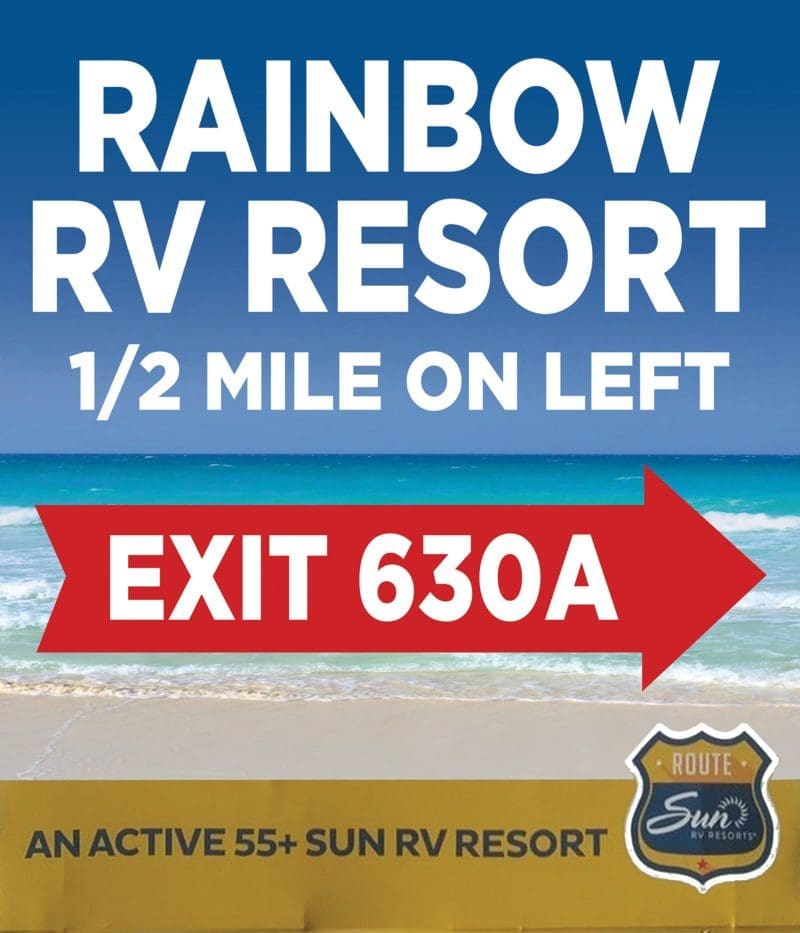
Rainbow Resort
Rating: 3 (average)
Today’s has good and bad features.
- The headline has high contrast with the background and uses a clean easy-to-read font.
- The directional is large and very legible inside a big red arrow.
- Unfortunately, the arrow covers up the focal point of the visual, that thing that’s worth a thousand words and evokes an emotion to make your outdoor ad zing.
- Then the ad loses contrast for the secondary directional with white text on a beige background.
- Finally, the very small text in the large gold box at the bottom might as well be a disclaimer; it’s too small to read at speed.
- I understand it goes with the logo in the lower right, probably for co-op money. This ad earns a 3 (average).
As always, I do not know the details of the art request or components of the campaign this ad may or may not have been part of. But looking at this challenge with the eye of an OOH graphic designer and through the lens of the target audience, I would have urged the advertiser to run the ad pictured below.
To receive a free morning newsletter with each day’s Billboard insider articles email info@billboardinsider.com with the word “Subscribe” in the title. Our newsletter is free and we don’t sell our subscriber list.
Paid Advertisement


