Rate This Ad allows a billboard designer to rate a random piece of billboard artwork using the following scale: 1 (not good), 2 (below average), 3 (average), 4 (very good), 5 (great). Then the designer talks about what they may have done differently for outdoor advertising. This week’s rating is provided by Greg Callaham (www.gregcallaham.com) who has over 30 years of experience in outdoor advertising design. Billboard Insider has uses and endorses Callaham’s services.
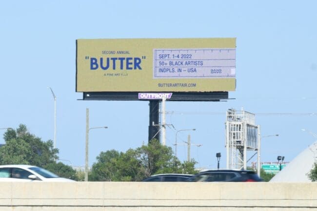
Butter
Rating: 2 (below average)
- This ad gets the viewers’ attention with its yellow background, but it could do a much butter job of communication the selling message.
- It’s about butter, but the pertinent information is too small and too thin to be read easily.
- The white area representing the measuring marks on a stick of butter might be a little too participant-specific for John Q Public to understand. It looks too much like a ruler.
- This ad earns a 2 (below average).
As always, I do not know the details of the art request or components of the campaign this ad may or may not have been part of. But looking at this challenge with the eye of an OOH graphic designer and through the lens of the target audience, I would have urged the advertiser to run the ad pictured below:

[wpforms id=”9787″]
Paid Advertisement