Rate This Ad allows a billboard designer to rate a random piece of billboard artwork using the following scale: 1 (not good), 2 (below average), 3 (average), 4 (very good), 5 (great). Then the designer talks about what they may have done differently for outdoor advertising. This week’s rating is provided by Greg Callaham who has over 30 years of experience in outdoor advertising design. Insider has used and endorses Callaham’s services.

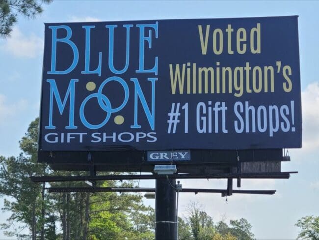
Blue Moon Gift Shop
Rating: 3 (average)
- The Blue Moon ad picture above does a reasonable job communicating the name of the advertiser and a five-word slogan.
- The light blue letters show up pretty well against the dark blue background.
- The yellow and white text of the tag line have contrast and read okay despite but are thin and compressed.
- The ad space is essentially divided into two vertical messages. That makes the read a little jumpy.
- This ad earns a 3 (average)
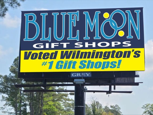
I would have encouraged the advertiser to run something that flowed smoothly in the Z-pattern the eye naturally follows when reading (shown below).

[wpforms id=”9787″]
Paid Advertisement


