Rate This Board allows a billboard designer to rate a random piece of billboard artwork using the following scale: 1 (not good), 2 (below average), 3 (average), 4 (very good), 5 (great). Then the designer talks about what they may have done differently for outdoor advertising. This week’s rating is provided by Greg Callaham www.gregcallaham.com) who has 30 years of experience in outdoor advertising design. Insider has used and endorses Callaham’s services.
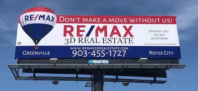
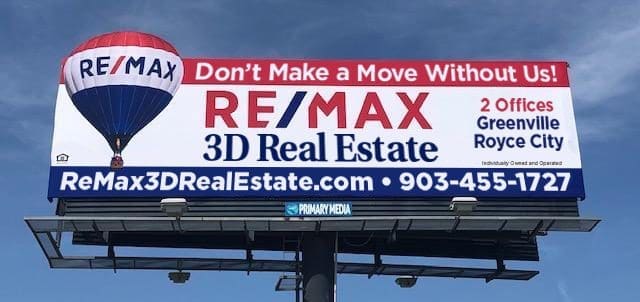
Remax Real Estate
Rating: 2 (below average)
- This board features a good use of extensions since the ReMax balloon just begs to float through the top plane of a billboard. The color bars do a nice job of echoing the ones on the balloon and the spacing allows for contrast between the background and the balloon, so nothing blends together.
- Thin text does not work well on a billboard.
- Large groups of words do not work well in all caps on a billboard.
- Long web addresses in all caps do not work well on a billboard. The only thing the target audience really gets out of the ad buy is ReMax Balloon, ReMax.
- I’m guessing the designer got caught between corporate branding standards and an advertiser-turned-art-director, and the result is this ad. Throw in a word count of twenty-five and this ad earns a 2 (below average).
Experience tells me the word count may not have been negotiable, so given the chance, I would have pushed the advertiser to run something closer to the layout below and pray for a traffic jam:
[wpforms id=”9787″]
Paid Advertisement