Rate This Ad allows a billboard designer to rate a random piece of billboard artwork using the following scale: 1 (not good), 2 (below average), 3 (average), 4 (very good), 5 (great). Then the designer talks about what they may have done differently for outdoor advertising. This week’s rating is provided by Greg Callaham who has over 30 years of experience in outdoor advertising design. Insider uses and endorses Callaham’s services.

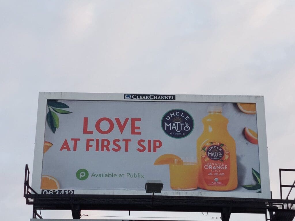
Love at First Sip
Rating: 4 (Very Good)
- Today’s ad features a brightly colored headline and product to draw the eye.
- The headline is a clever twist on a cliché that ties it directly to the product in a positive memorable way.
- The product logo isn’t the best for outdoor advertising, but sometimes you have to work with what you have. The designer did a nice job of locating it next to the photo, so the target audience knows to look for a big black dot on an orange jug of juice in direct response to this ad.
- What they might need more help with is where to find the product. The Publix logo is too small, and the directional text is too small and thin. Both are better suited to advertising that is handheld or within a few feet of the target audience than they are to a billboard. That keeps this ad from landing a perfect score.
- This ad earns a 4 (very good).
[wpforms id=”9787″]
Paid Advertisement


