Rate This Ad allows a billboard designer to rate a random piece of billboard artwork using the following scale: 1 (not good), 2 (below average), 3 (average), 4 (very good), 5 (great). Then the designer talks about what they may have done differently for outdoor advertising. This week’s rating is provided by Greg Callaham who has over 30 years of experience in outdoor advertising design. Insider has used and endorses Callaham’s services.
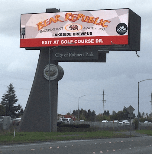
Bear Republic
Rating: 3 (average)
- This ad uses bright colors to attract the eye.
- The logo dominates the billboard, but is still not super easy to read due to the arced semi-three-dimensional lettering.
- The “explanation text” could have been bigger to help the target audience understand the nature of the business advertised.
- The red color bar across the bottom begs to be looked at and is the perfect place for the directional. Unfortunately, the directional text is a little undersized.
- The two small logos on either side are probably required, but are essentially illegible.
- This board earns a 3 (average).
[wpforms id=”9787″]
Paid Advertisement
