Rate This Ad allows a billboard designer to rate a random piece of billboard artwork using the following scale: 1 (not good), 2 (below average), 3 (average), 4 (very good), 5 (great). Then the designer talks about what they may have done differently for outdoor advertising. This week’s rating is provided by Greg Callaham who has over 30 years of experience in outdoor advertising design. Insider has used and endorses Callaham’s services.
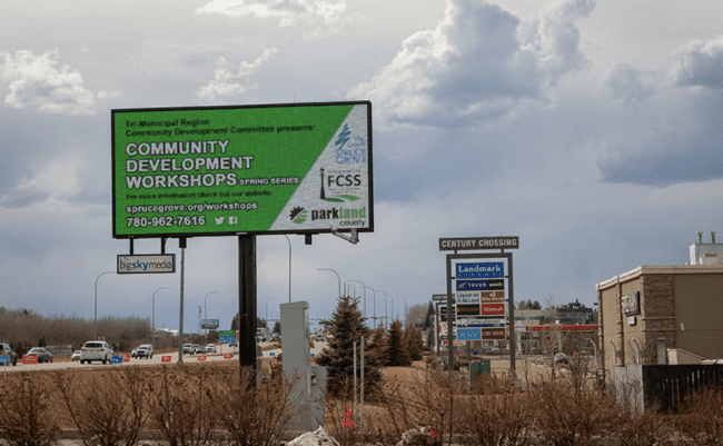
Community Development Workshops
Rating: 2 (below average)
- This billboard has far too much on it to be effective. I suspect this was art-directed into the final version by three different municipal agencies. Such projects are frustrating for the designer and OOH vendor alike because each is effectively prevented from demonstrating their skills to actually benefit the entities advertised.
- The word count is 21 plus the three logos on the right and the social media icons.
- There’s not enough contrast between the black lettering and the green background.
- The result here is a relatively illegible billboard that satisfied a few organizational requirements, but did not convey the selling message in a simple, memorable manner. This ad earns a 2 (below average).
[wpforms id=”9787″]
Paid Advertisement