


Rate This Ad allows a billboard designer to rate a random piece of billboard artwork using the following scale: 1 (not good), 2 (below average), 3 (average), 4 (very good), 5 (great). Then the designer talks about what they may have done differently for outdoor advertising. This week’s rating is provided by Greg Callaham who has over 30 years of experience in outdoor advertising design. Insider has used and endorses Callaham’s services.
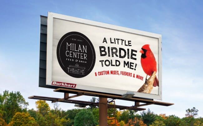
Milan Center
Rating: 2 (below average)
- This ad uses a vibrant splash of color to get the attention of the target audience. Unfortunately, that draws the eye past the business name, which is too small and thin to read easily.
- It uses the same color for the selling message, which is also too small to read easily.
- That leaves us with a clever tag line, a bird, and a question instead of actionable information. I’m afraid it earns a 2 (below average).
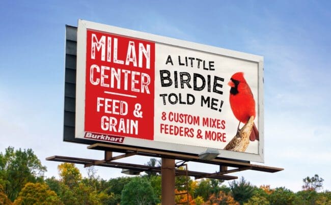
As always, I do not know the particulars of the art request or other components of the marketing efforts this ad may have been part of, but looking at this challenge with the eye of an OOH graphic designer and through the lens of the target audience, I would have urged the advertiser to run the ad pictured below:
[wpforms id=”9787″]
Paid Advertisement