Rate This Board allows a billboard designer to rate a random piece of billboard artwork using the following scale: 1 (not good), 2 (below average), 3 (average), 4 (very good), 5 (great). Then the designer talks about what they may have done differently for outdoor advertising. This week’s rating is provided by Greg Callaham (www.gregcallaham.com) who has 30 years of experience in outdoor advertising design. Insider has used and endorses Callaham’s services.
Judy.co
Rating: 5 (great)
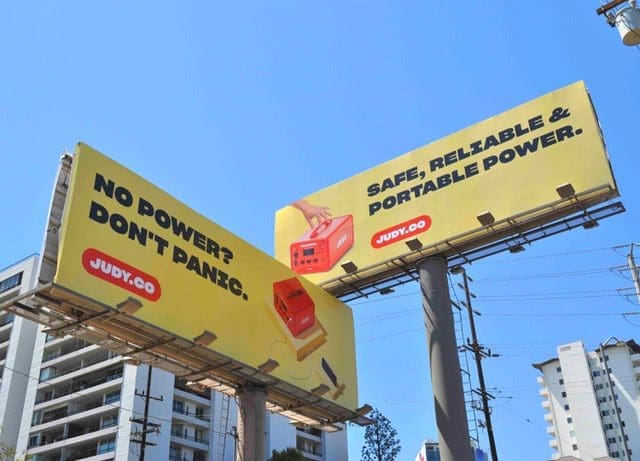
Sometimes the creative is not simply the design, it can also include the use of available ad space. These two ads do just that.
- The bright yellow backgrounds immediately draw the eye to the ads.
- The brief black headlines offer high contrast for a boost in legibility.
- The bright orange logo and product photos are the next thing the viewer sees. That’s it. End of ad. If the headline speaks to your needs, get the product advertised.
- The only thing I might have done differently would be to choose a different font for the headline. The capital “I” in each headline looked like a capital “Z” at first glance. It could be caused by the angle of this photo, so I’m not going to count it as a fault.
- The double-barreled use of ad space imprints the selling message and the brand on the viewers’ brains.
Job well done! These ads earn a 5 (great).
[wpforms id=”9787″]
Paid Advertisement







I’d rate this copy a 2