Rate This Ad allows a billboard designer to rate a random piece of billboard artwork using the following scale: 1 (not good), 2 (below average), 3 (average), 4 (very good), 5 (great). Then the designer talks about what they may have done differently for outdoor advertising. This week’s rating is provided by Greg Callaham www.gregcallaham.com) who has 30 years of experience in outdoor advertising design. Insider uses and endorses Callaham’s services.

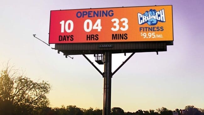
Crunch Fitness
Rating: 3 (average)
- I’ve lost track of how many times over the last thirty years I have asked, “What is the one thing you want to say on this billboard?” But I can count the number of times the answer has been one thing on one hand. This advertiser will not join that short little list. It appears they simply could not commit to the countdown or the price point, and so they made each less message effective.
- A big orange rectangle in the sky is going to draw the eye. A countdown is going to make viewers wonder what it is about. The answer is not clear because someone insisted on jamming a $9.95 price under the logo. It should only be a larger (and therefore, easier to read) advertiser logo. Or it should be a huge $9.95 per month ad with no countdown.
- Our medium works best when we Keep It Super Simple. I’m sure this ad made the target audience look. I’m also sure it could have communicated a single message more clearly and effectively than it did trying to communicate two messages. This billboard gets a 3 (average).
[wpforms id=”9787″]
Paid Advertisement


