Rate This Ad allows a billboard designer to rate a random piece of billboard artwork using the following scale: 1 (not good), 2 (below average), 3 (average), 4 (very good), 5 (great). Then the designer talks about what they may have done differently for outdoor advertising. This week’s rating is provided by Greg Callaham www.gregcallaham.com) who has 30 years of experience in outdoor advertising design. Insider has used and endorses Callaham’s services.
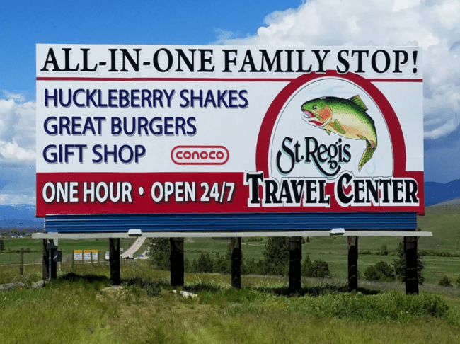
St Regis Travel Center
Rating: 3 (Average)
- Billboards for various roadside travel centers are part of my childhood memories. They meant a chance to stop, stretch our legs, and grab a quick meal or snacks or maybe even a pecan log was just ahead. This board appears to advertise just such a place. While it’s not a super creative ad, it gets the job done.
- The high contrast lettering against a white background is not a strenuous read, but could be easier. The headline and features could be a little bolder, and it would help tremendously if there were some lowercase letters used in the selling message.
- There’s too much “sameness” when every word is all caps. It something advertisers tend to want so things stand out, but when everything is styled to stand out, nothing does.
- That may also be the reason behind the decision to give all the text a drop shadow. It’s a nice effect to give a design depth and emphasize certain words. It works best when used sparingly. It also tends to clog things up when used with dark letters. Instead of making the text “pop,” in muddies things and makes it harder to read.
- Notice the light grey under the headline. That’s not too bad. There is a white outline that gives the letters some separation from the shadow, so it’s still pretty legible. The bottom line of copy is white letters against a darker background and the shadow works well to make the message stand out. The shadow does not help the blue text in the middle. In fact, it hampers the ability to read it quickly. It’s not awful, it just makes things look more like a fourth generation copy of a fax instead of adding depth.
- All caps, a few too many words, and the overuse of drop shadows hold this ad down to a 3 (average).
[wpforms id=”9787″]
Paid Advertisement