


Rate This Ad allows a billboard designer to rate a random piece of billboard artwork using the following scale: 1 (not good), 2 (below average), 3 (average), 4 (very good), 5 (great). Then the designer talks about what they may have done differently for outdoor advertising. This week’s rating is provided by Greg Callaham www.gregcallaham.com) who has over 30 years of experience in outdoor advertising design. Insider has used and endorses Callaham’s services.
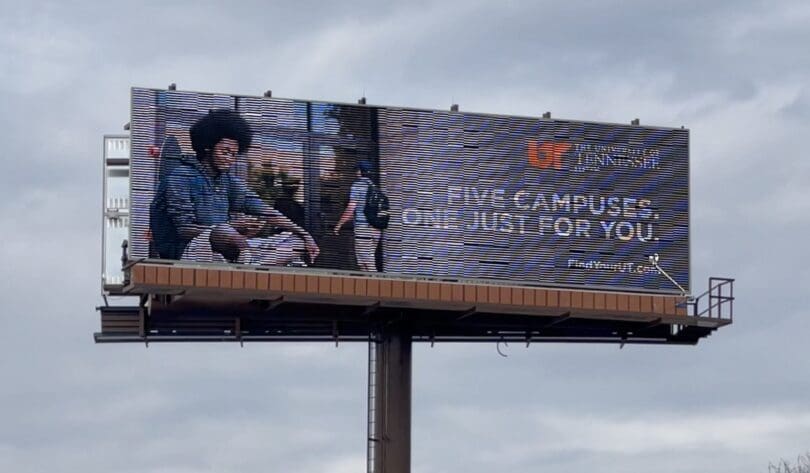
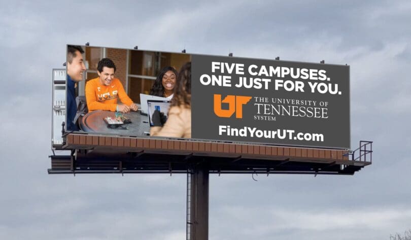
University of Tennessee
Rating: 2 (below average)
- The ad pictured here is for a university system with multiple campuses. The tag line is well written and covers the variety of choices while personalizing the message.
- There is an overall lack of eye-catching color in the ad which makes it easy to ignore.
- Parts of the tagline are difficult to see due to a lack of contrast.
- The point of contact to act on the selling message, although well-positioned, is so tiny it is not legible to the target audience.
- This ad earns a 2 (below average).
As always, I do not know the details of the art request or components of the campaign this ad may or may not have been part of. But looking at this challenge with the eye of an OOH graphic designer and through the lens of the target audience, I would have encouraged the advertiser to run the ad pictured below to promote the same message in a similar style. It utilizes imagery and colors from the advertiser’s web site.
To receive a free morning newsletter with each day’s Billboard insider articles email info@billboardinsider.com with the word “Subscribe” in the title.Our newsletter is free and we don’t sell our subscriber list.
Paid Advertisement