


Rate This Ad allows a billboard designer to rate a random piece of billboard artwork using the following scale: 1 (not good), 2 (below average), 3 (average), 4 (very good), 5 (great). Then the designer talks about what they may have done differently for outdoor advertising. This week’s rating is provided by Greg Callaham www.gregcallaham.com) who has over 30 years of experience in outdoor advertising design. Insider has used and endorses Callaham’s services.
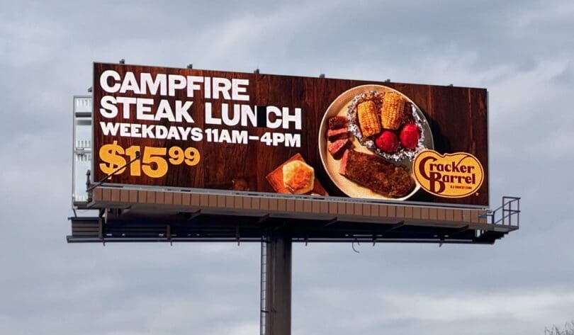
Cracker Barrel Steak Lunch
Rating: 3 (average)
- The ad pictured here makes the name of the meal crystal clear.
- The offer constraints are rather prominent.
- The price point could use more contrast and the dollar sign competes with the numbers for attention. The photo is large, but oddly cropped.
- The logo seems to be an afterthought due to its small size.
- There is also no directional and this board is near and advertiser restaurant just off a nearby exit.
- This ad earns a 3 (average).
As always, I do not know the details of the art request or components of the campaign this ad may or may not have been part of. But looking at this challenge with the eye of an OOH graphic designer and through the lens of the target audience, I would have encouraged the advertiser to run the ad pictured below to promote the same message in a similar style.

To receive a free morning newsletter with each day’s Billboard insider articles email info@billboardinsider.com with the word “Subscribe” in the title. Our newsletter is free and we don’t sell our subscriber list.
Paid Advertisement


my photo seems to have a black block between N and C in LUNCH. any significance to that?
Much better, but overall, I think it’s too dark.