


Rate This Ad allows a billboard designer to rate a random piece of billboard artwork using the following scale: 1 (not good), 2 (below average), 3 (average), 4 (very good), 5 (great). Then the designer talks about what they may have done differently for outdoor advertising. This week’s rating is provided by Greg Callaham (www.gregcallaham.com) who has over 30 years of experience in outdoor advertising design. Insider has used and endorses Callaham’s services.

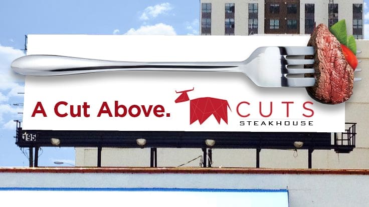
A Cut Above
Rating: 3 (Average)
- The ad pictured above does a very good job of enlarging a common object to the size of a billboard to get attention. And the extensions are very cool.
- However, the tag line is too thin, the logo is small and part of it is almost illegible.
- There are also some odd treatments for the background with the white border around an off-white rectangle and the random grey lines, which I suppose are meant to echo the lines in the cow icon, but those are too small for the viewer to see.
- The ad makes me want a steak, but leaves me wondering where I could get one.
- The ad earns a 3 (average).
As always, I do not know the details of the art request or components of the campaign this ad may or may not have been part of. But looking at this challenge with the eye of an OOH graphic designer and through the lens of the target audience, I would have encouraged the advertiser to run the ad pictured below to promote the same message using a similar style.
To receive a free morning newsletter with each day’s Billboard insider articles email info@billboardinsider.com with the word “Subscribe” in the title. Our newsletter is free and we don’t sell our subscriber list.
Paid Advertisement


I gave it a 4, because of the great creative, but the logo is way too small. The revised is a huge improvement and I now give it a 5. 🙂