


Rate This Ad allows a billboard designer to rate a random piece of billboard artwork using the following scale: 1 (not good), 2 (below average), 3 (average), 4 (very good), 5 (great). Then the designer talks about what they may have done differently for outdoor advertising. This week’s rating is provided by Greg Callaham www.gregcallaham.com) who has over 30 years of experience in outdoor advertising design. Insider has used and endorses Callaham’s services.
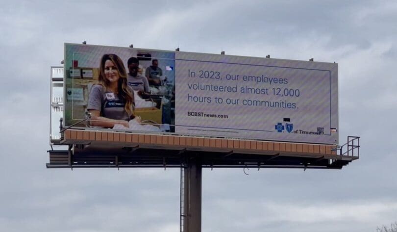
Blue Cross Blue Shield of Tennessee
Rating: 2 (below average)
- This ad is meant to inform the public about an insurance company’s community involvement via its employees. Unfortunately, there is too much text and it is too thin, which makes the ad difficult to read, understand, and remember.
- In addition the logos are so small it’s easy for the target audience to miss who is trying to communicate with them.
- The ad earns a 2 (below average).
As always, I do not know the details of the art request or components of the campaign this ad may or may not have been part of. But looking at this challenge with the eye of an OOH graphic designer and through the lens of the target audience, I would have urged the advertiser to run the ad pictured below to promote the same message:

To receive a free morning newsletter with each day’s Billboard insider articles email info@billboardinsider.com with the word “Subscribe” in the title. Our newsletter is free and we don’t sell our subscriber list.
Paid Advertisement


I would give it a 2 at best. Too many words, not an impactful visual. I don’t think the revision is much better. BCBST would have to be well branded for consumers to know what it is. Overall, I would completely rethink this art.
ditto on what Mel Said!