Rate This Ad allows a billboard designer to rate a random piece of billboard artwork provided by Billboard Insider using the following scale: 1 (not good), 2 (below average), 3 (average), 4 (very good), 5 (great). Then the designer talks about what they may have done differently for outdoor advertising. This week’s rating is provided by Blip Billboards. Blip has a staff of creative designers to assist clients. Insider uses and endorses Blip’s services.
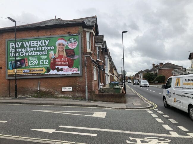
Pay Weekly
Rating: 1 (not good)
- This ad has good color contrast and good visual hierarchy and we are quickly drawn to what looks like key information at the top.
- There is however too much information being crammed into the canvas.
- The main message/value/call to action is not clear.
- There is too much text and information overload.
- The brand is not immediately apparent in this ad.
We would improve this ad by making the ad understandable at a quick glance. A good way to do this is to always include these three elements in design: Logo/image, succinct core message and contact information. Prioritize “information hierarchy”: emphasize the most valuable information to the customer. Eliminate distraction by removing anything that is not essential to delivering that core message.
[wpforms id=”9787″]
Paid Advertisement








Way too busy
Not good does not begin to describe how horrible this “creative” is….