Outfront has revised its corporate logo as part of a brand refresh. You can read Outfront CMO Jodi Senese’s thoughts on the brand refresh here. Out with the old…

in with the new…

The small logo changes from this…
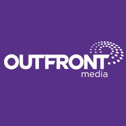
to this…

Insider asked two billboard/logo designers what they think of Outfront’s new logo.
Melody Roberts, Out of Home Creative: “Strong, Timely and / Forward thinking.”
Greg Callaham, Greg Callaham Graphic Design: “The new Outfront logo is clean and simple, while establishing a singular identity of its own. It maintains the brand equity built by the previous iteration, which is sometimes trickier than you might think. I especially like the forward slash. It implies the connectivity of their brand to their services and the client’s needs. It’s also a terrific graphic element for use in collateral materials and self-promotion.”
What do you think. Let Insider know using the form below.
[wpforms id=”8663″]
Paid Advertisement
