Today digital billboard manager Leslie Morris of Skydragon Designs talks about what’s in an effective out of home promo and an effective out of home ad.

What’s in a good promo ad?
You want it to grab a person’s attention. Bright colors, even a picture of something witty – a big bird, a Toucan, a funny picture of a dog/cat or a baby. Text wise Rent This Board seems to be a good tag. I’ve noticed it’s more effective than Advertise Here.
What is the call to action for a promo?
Most of the signs have a phone number. I also think it’s a good idea to include the account executive’s picture. Then people know who they are calling. We have one AE keeps his picture on the promos and we dress him for the season or holiday (e.g. elf suit at Christmas). That gets attention. And keep the ad fresh. It can be as simple as changing the color of the background. We ignore things we see a lot.
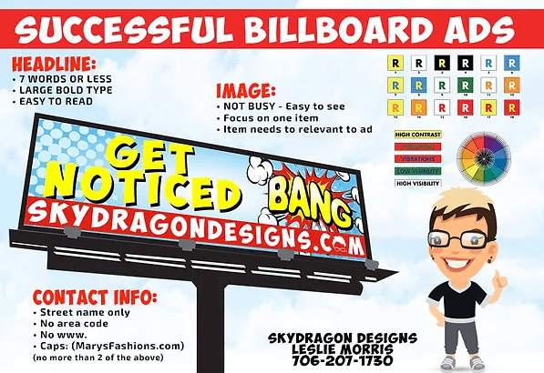
You have an infographic on your website but what makes for a good billboard ad?
Thanks. Here it is.
What are the three musts for a billboard ad?
A good billboard ad should communicate 3 things.
- Who you are ( logo) if its good.
- What you do ( Picture of goods your selling?)
- How to contact you. ( Where do you want your traffic from the ad)
What about a picture?
Yes, we are visual as humans and as they say a picture is worth a thousand words. If you are a roofer, let’s put a simple picture of a house roof. MAIN MESSAGE It’s got to be very simple.
You can contact Leslie at leslie@skydragondesigns.com or 706-207-1730.
To receive a free morning newsletter with each day’s Billboard insider articles email info@billboardinsider.com with the word “Subscribe” in the title. Our newsletter is free and we don’t sell our subscriber list.
Paid Advertisement
