 By Melody Roberts
I like to ride the market to see who is advertising, what outdoor advertising creative is working or what could possibly be improved upon. This lets me to see how my billboard design concepts translate to the real world location of the structure. By doing so, it helps me to consult clients on why certain designs will or won’t work, especially for locations that are a little out of the norm.
Recently, I was in bumper to bumper traffic on a major interstate in Atlanta, Georgia and saw these two digital billboards. They’re placed much higher than your average highway billboard and if you are driving at regular interstate speeds, chances are these advertisements may be missed. However, if the location of the structure is discussed during the creative concept phase, then the design can be tailored to meet the client’s expectations while still being effective.
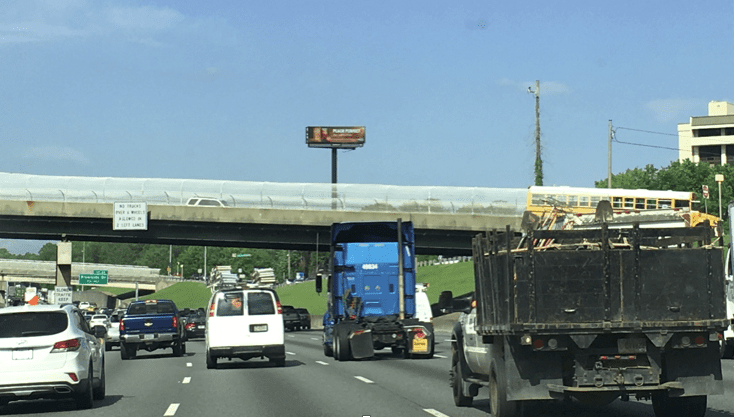
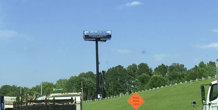
After seeing some of these out of home advertisements, I thought it would be a good idea to share some thoughts on the creative and how to manage client expectations when selling these types of locations. It is very important to educate clients and agencies that at this height and the fact that because these are digital faces which flip, there is another level of consideration compared to static vinyl billboards.
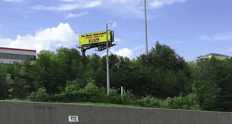
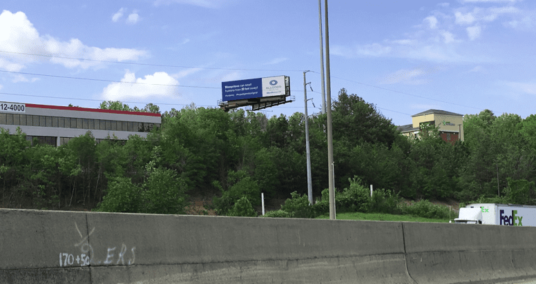
When selling this type of location, work with an experienced out of home designer who can utilize this space effectively. High billboard structures such as these have their place, when designed correctly they can be stand out advertising as far as 1,000 feet away. Tip: sell your clients on getting a vanity number or website (404-CUT-TREE is an example) to engage and peak curiosity from motorists sitting in traffic vs. trying to include too many elements which may be harder to read or remember in this type of location. Color contrast and bold fonts work best in these types of spaces.
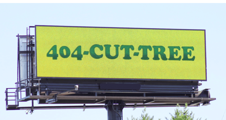
With digital’s flexibility and real time messaging, it may even be worth putting up the client’s artwork and another design customized for the structure site so the customer can see the comparison between the two. In this case, if it’s really high up it may not translate the same as it would on a regular height billboard and may be ineffective for them. Our goal as out of home advertising experts is to inform our customers how to maximize industry best practices for the best return given the particulars of each individual structure. By investing time at the inception of the creative, you’ll avoid getting a call from an unsatisfied client later.
I often hear clients are skeptical to buy outdoor advertising because they see advertisements that don’t read well. They don’t want to run into the same issue, so I work with them to ensure their advertisements are visible and often request a location photo to superimpose the creative on the board so they can get an idea of how it will look.
When clients contact Out of Home Creative to design a digital advertisement or campaign, I always ask whether they’re going to be on one location or if they will be rotating/space avail because they may not be thinking that they need a specific design customized for a certain location. In my opinion, good creative advertising sells space, not the other way around. Take time to inform your clients on billboard design best practices and most will appreciate the feedback.
Out of Home Creative is an outdoor advertising firm which designs billboards, digital campaigns, transit, and street furniture to any non-traditional out of home advertising. Based in Atlanta, Georgia we serve businesses, agencies, media buyers and out of home companies throughout North America. Melody Roberts is the Founder and CEO.
[wpforms id=”9787″]
Paid Advertisement
