Brent Baer, OOH General Manager and National Sales Signal Outdoor Advertising, ran this post on how to take great billboard pics on his linkedin page. Insider thinks the advice is timeless and has reprinted the article with Baer’s consent here.
Ever receive a #billboard photo which made evaluation more difficult? Let’s look at what makes a good photo for a photo or ride sheet, including the mistakes to avoid.
If you have worked on the out-of-home (OOH) buyer’s side for any period of time, you have seen a wide variety of photos within photo sheets that represent a billboard company’s ‘best efforts’ via a photograph seeking consideration for purchase of space. The photo sheet is used as an inducement to buy a particular location. Every #OOH owner seeks to present the best possible image of their OOH inventory. Sometimes the photo in the sheet submitted makes you wonder about the quality of the location and maybe even about the company who submitted it. An OOH owner’s opportunity to demonstrate the proximity of the sign and quality of the location is a daily occurrence. The Photo Sheet , Ride Sheet or “blurb” — as we called them in the old days — was the OOH owner’s proof of a quality location (but not proof of performance). I have been fortunate to view literally thousands of different OOH owners’ photo sheets on both the agency and the owner’s side of the fence. The variations are astonishing. Like a family photo, the photo should be the best shot the owner can muster. But sometimes, someone, has their eyes closed and ruins the shot. What makes a good photo?
Follow these 12 rules to help you sell your space and get paid on time.
1. The billboard is front and centered of the frame.
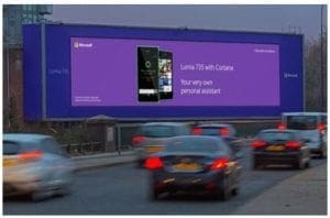
2. Show traffic in the photo. Whether it’s cars or people for (street furniture or experiential), show real traffic. Don’t send your OOH sales team out to the interstate and have them slow down to a near dead stop while your photographer stands ready to capture a rush hour traffic tie up which doesn’t normally occur. (Yes, this happened in the 80’s in a southern city.)
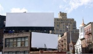
3. Shoot at street level — no rooftop or bridge top photos. Photos taken from a position other than where the intended impression is counted is misleading; a red flag to buyers. Position the camera at the same street level as the eyes of the audience. If I see another photo where the camera is at roof top level peering down on the sign, I may consider jumping.

4. Position the camera on the same side of the road as the media would typically be viewed. I am not talking about a cross reader. While I was working at Posterscope, whenever we received a photo where the camera was positioned across the street looking backwards or sideways to the sign of interest, we knew we had a problem and kicked it out. Sometimes we would ask for another photo shot. That second chance does not always come about for the vendor. It’s a lost sales opportunity and question of trust.
5. Provide a photo with the camera positioned from the center or the right side of the road. Stopping in the emergency area on the left side, or positioning the shot from the far left lane shooting across three or four lanes to the right, leads to questions of obstructions, trees, or buildings. Either way it spells: BLOCKED VIEW!
6. Keep it real. Keep the trees, light poles, wires, and obstructions. Stop uasing Photoshop or other software refinements, which mislead.
7. Add a white or yellow electronic “block out” with great caution. Keep the size of the face accurate. Don’t embellish with a larger than reality “block” over the top of the photo.
8. It’s okay to add an arrow or another means to identify your billboard face when others exist in the frame. Billboard farms happen. Make it easy for us to identity which face is yours.
9. No China photos! Keep a distance so the viewer can identify the area. Providing a photo so close that there are no unique identifying characteristics in the frame could leave the viewer to wonder if it’s in China or Georgia.
10. Keep the photos updated. The 1999 Oldsmobile as part of the traffic in the picture is a dead giveaway.(Olds went out of business in 2004.) Trees grow significantly in 10 years. Time to update the entire plant’s photo inventory.
11. Use technology to verify. In the words of Ronald Reagan: “Trust, but verify.” Some agencies require a Google photo or a recently taken photo of the submitted billboard for purchase consideration. Google photos are a good source to verify. Use AdPro to verify. (I would be remiss if I did not suggest the software I sell, AdPro. Our Exposure Analyzer feature uses elevation data to verify the obstructions and visibility of a location and provides the exposure time by day, as well.
12. Hire a professional photographer and provide the 12 Rules.
The suggestions above are for “approach shots.” “Beauty shots” are a different story (and perhaps a later post). These rules are for photographing and submitting OOH locations for client approval and proof of performance. Follow them and it will help you sell your space and get paid on time. This could be the last worthless photo sheet.
Any references to how you may operate and provide photos as an OOH owner is purely coincidental. I believe most poor photo sheets are submitted out of ignorance, without the intention to mislead. (Well, except for the traffic fabrication incident mentioned in rule #2.) #OOH buying services
Paid Advertisement











Great pictures Brent.