By David Oakill, DavidOakill.com.
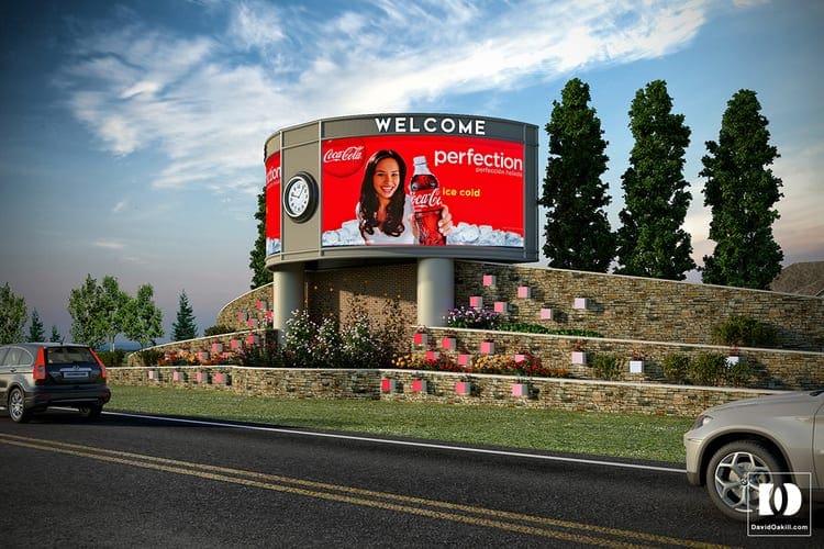
Recently, I was asked to render a couple concepts for billboards that would appear to blend in with their surroundings as opposed to just being placed on site. The following images were created to show what landscaping the existing site would do to create this effect. The ads were just place-holders as their was no end client at this stage.

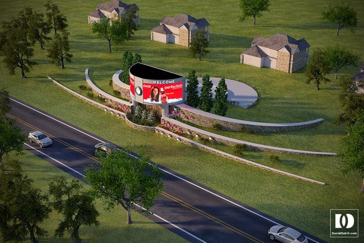
The first concept rendering above shows the site coming up to meet the signage. There is a neighborhood in the background that would also be exposed to the advertising so consideration was taken to hide the signage from their perspective while giving them a barrier both physical and visual between their property and the road.

The landscape grows to support the structure. Retaining walls were used to step the site and raise it to a level just below the sign. The site for this project was yet to be determined, but it was planned for suburban Philadelphia. This houses are used for context to understand how the design would effect a typical suburban Philadelphia community.
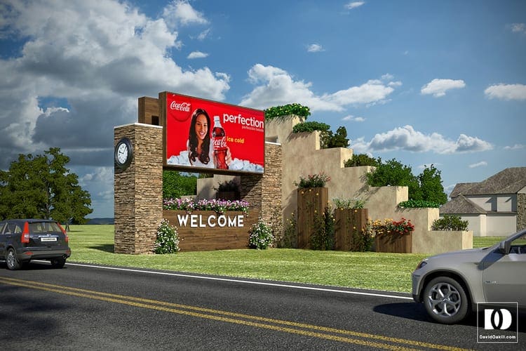
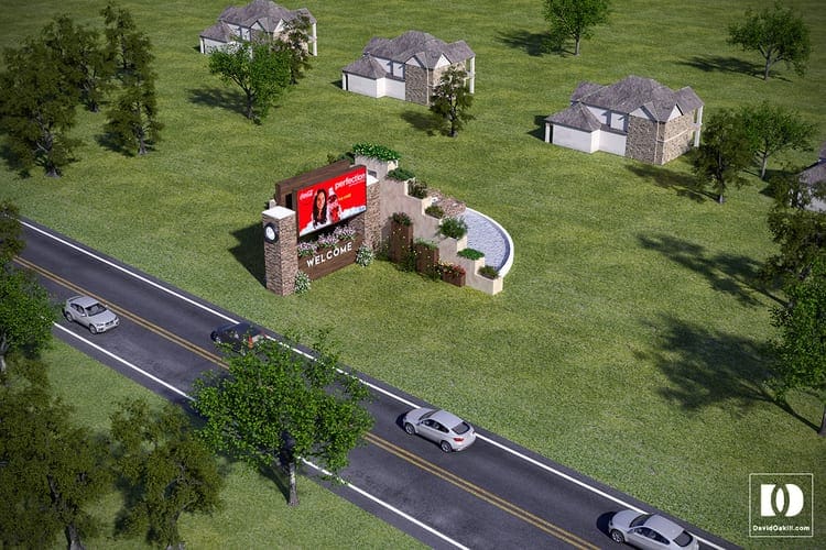
The second option revised the initial concept in a more compact and less organic design. The landscape is still terraced, but incorporates more natural materials. Both options utilize water elements.

Above, the smaller footprint of the second option can be seen in the aerial rendering. The use of two renderings per concept allows the viewer to see a perspective of the design as it would be experienced in real life. The use of aerial renderings provide context and allow the viewer to engage the design by quickly orienting them. This is especially useful when explaining your design to people that may not be able to read elevation and plan drawings.


