 This week’s billboard design tips come from the JCDecaux’s Creative Guidelines.
- Keep it simple. Viewers have 2 seconds to read a bus shelter ad.
- Be legible. Avoid thin type and complicated backgrounds.
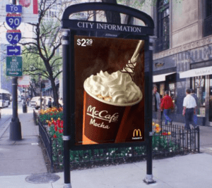
- High Contrast Colors. Look at the contrasts in this JCDecaux McDonalds ad. Black Letters on a yellow or white background are best. White or yellow letters on a black background also standout.
- Use a clear image. A good picture makes words moot.
- Celebrities attract attention.
- Create dialogue, not just monologue. Involve or challenge your audience.
- Location matters. Post your campaign where your audience will be.
Paid Ad


