Rate This Ad allows a billboard designer to rate a random piece of billboard artwork using the following scale: 1 (not good), 2 (below average), 3 (average), 4 (very good), 5 (great). Then the designer talks about what they may have done differently for outdoor advertising. This week’s rating is provided by Greg Callaham www.gregcallaham.com) who has over 30 years of experience in outdoor advertising design. Insider has used and endorses Callaham’s services.

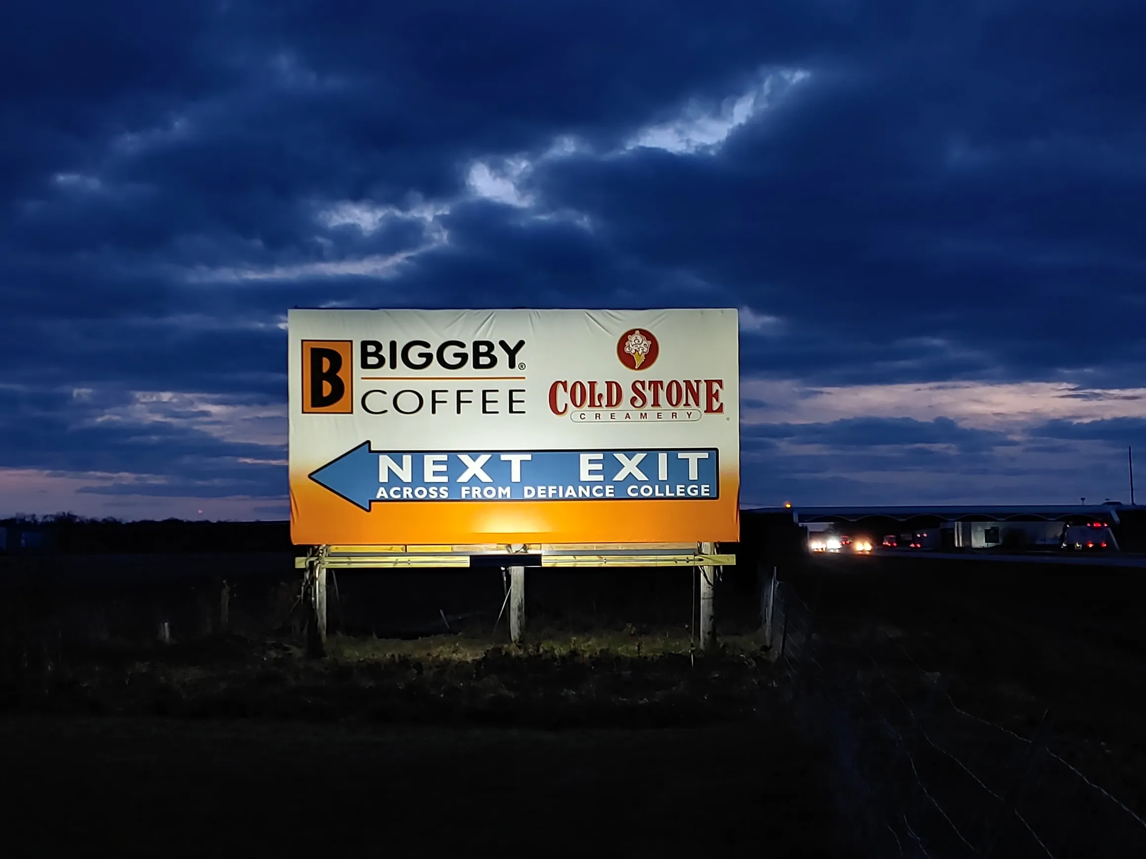
Bigby Coffee
Rating: 3 (average)
- Here we have a basic dual advertiser outdoor ad. It’s been handled rather well with just the logos and directional with no additional ad copy to clutter it up.
- There are only eleven words in the ad.
- The bi-color background works well to give contrast to the logos and arrow.
- The yellow at the bottom helps draw the eye.
- While it’s not very creative, the ad does do its job. For that, it earns a 3 (average).
To receive a free morning newsletter with each day’s Billboard insider articles email info@billboardinsider.com with the word “Subscribe” in the title. Our newsletter is free and we don’t sell our subscriber list.
Paid Advertisement


