Rate This Ad allows a billboard designer to rate a random billboard ad using the following scale: 1 (not good), 2 (below average), 3 (average), 4 (very good), 5 (great). Then the designer talks about what they may have done differently for outdoor advertising. This week’s rating is provided by Wes Frick of Wes Frick Design Agency.
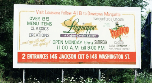
Lagnappe
Rating: 1 (Not Good)
- This billboard is an oft-cited example of poor creative.
- A restaurant ad needs a food picture.
- There are 20 words. A good design uses 6-8 words.
- elements compete for attention against one another.
- Thin fonts are hard to read
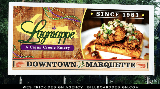
Here’s how I’d fix the ad.
- A picture speaks 1000 words. A sandwich picture will interest people in the restaurant.
- I changed the confusing directionals to “Downtown Marquette”
- I reduced the word count and simplified the layout.
- I used a thick bold font
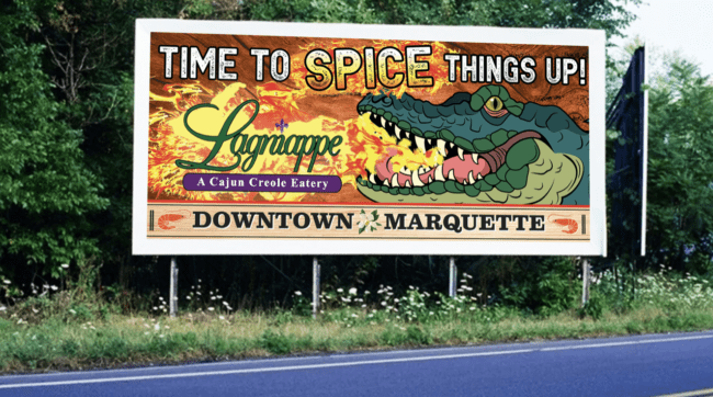
- Here’s a “Time to Spice Things Up!” alternative featuring a fire breathing crocodile.
- A crocodile is a Cajun favorite and the flame will grab attention.
[wpforms id=”9787″]
Paid Advertisment


