Rate This Ad allows a billboard designer to rate a random piece of billboard artwork using the following scale: 1 (not good), 2 (below average), 3 (average), 4 (very good), 5 (great). Then the designer talks about what they may have done differently. This week’s rating is provided by Greg Callaham (www.gregcallaham.com) who has 30 years of experience in outdoor advertising design. Insider uses and endorses Callaham’s services.

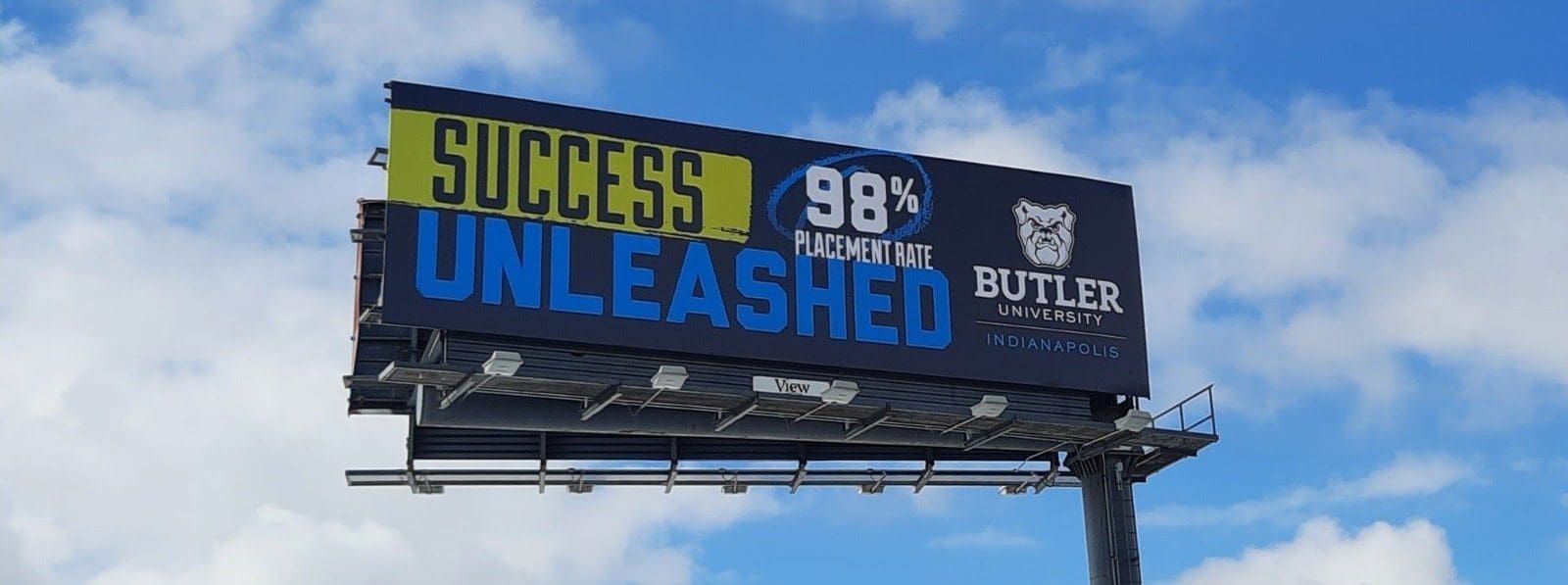
Butler University
Rating: 3 (average)
- This ad for Butler University touts the placement rate of the university’s graduates. However, that message isn’t crystal clear the first time one reads this board. And sometimes, one time is all we get.
- The word “success” is highlighted by yellow to draw the eye to the ad and make that word the focus of the message.
- The word “unleashed” comes too close to invisibility as royal blue letters on a dark blue background. Those are the advertiser’s colors, but there is not enough contrast to guarantee legibility in this arrangement.
- The “98%” stands out nicely, but the “Placement Rate” is small enough to get lost.
- The logo is probably locally well-known, but the word “Indianapolis” is thin and tone-on-tone, making it disappear. It earns a 3 (average).
As always, I do not know the particulars of the art request or components of the campaign this ad may or may not have been part of. But looking at this challenge with the eye of an OOH graphic designer and through the lens of the target audience, I would have urged the advertiser to run the ad pictured below:

The word “success” and the “98% Placement Rate” are tied together visually by bright yellow, drawing the eye and driving the main selling message home. The word “unleashed” is more legible and is visually tied to the logo and bulldog mascot by making it white. The logo is larger and the word “Indianapolis” is white so it can be read more easily.
[wpforms id=”9787″]
Paid Advertisement


