Rate This Ad allows a billboard designer to rate a billboard ad using the following scale: 1 (not good), 2 (below average), 3 (average), 4 (very good), 5 (great). Then the designer recommends how to improve the ad. This week’s rating is provided by Melody Roberts, an OBIE nominated billboard designer and founder of Out of Home Creative, an outdoor advertising design firm specializing in out of home design for businesses, agencies, media buyers and out of home companies. Melody has been in the outdoor industry since 2001. Insider uses and endorses her services.
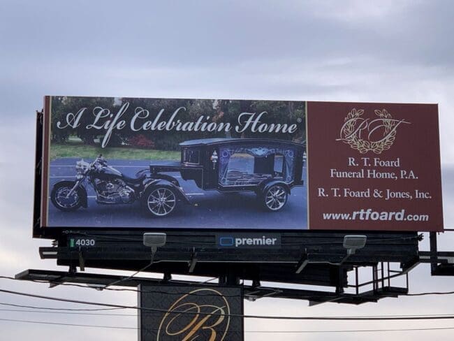
R.T. Foard Funeral Home, P.A.
Rating 1
Please Note: For all ratings, I don’t know if a client insisted on certain elements or how much experience the designer had with out of home advertising. My recommendations requested by Billboard Insider are solely based on how I would have approached the creative design.
This would have been a challenge working with this photo and logo, but I believe there could have been a different approach to designing this. The overall layout and logo look dated, and the image is not easy to make out what it is. I would have had a conversation with the client about using a tagline to explain what they offer instead of using the image and logo. And maybe that happened, and the designer couldn’t convince the client otherwise. Either way, below are alternatives and things to remember if you come across a similar request in the future:
- Keep your colors, fonts, and visuals in mind when designing OOH (and on-trend) because just one of those choices can throw something off. When I see Burgundy paired with a Serif font, I immediately think of 1990’s attorney advertising.
- It isn’t necessary to have “www” as part of a URL.
- Script fonts can be challenging to read on a billboard. If I use a script, I may use it on one word or a two-word slogan, and I’m picky about which script fonts I use because the more detail to it, the harder it is to read far away.
- Companies do not generally design logos with OOH in mind, so it is essential to explain to clients that for their business name to be visible and memorable, there may be a need to modify their logo for outdoor. In this situation, I would have begged the client to leave the company logo off and only have their name.
- The second line, “R.T. Foard & Jones, Inc.,” may have been required but could have been disclaimer size.
- It’s clear the client wanted to focus on the image because of its unique style of transportation. And it is unique, but I think it’s hard to make out on a billboard. If they insisted on using it, I would have isolated the image, placed it against a contrasting background and paired it with a slogan to help explain the visual. I visited their website, and I like what they’re using now with the same image above, “An Unforgettable Farewell Ride” I would have added “We Offer” before that.
Alternatively, instead of the image, they could have used “We Offer an Unforgettable Farewell Ride” and focused on the website for people to find out more about what out of home means.
[wpforms id=”9787″]
Paid Advertisement
