


Rate This Ad allows a billboard designer to rate a random piece of billboard artwork using the following scale: 1 (not good), 2 (below average), 3 (average), 4 (very good), 5 (great). Then the designer talks about what they may have done differently for outdoor advertising. This week’s rating is provided by Greg Callaham www.gregcallaham.com) who has 30 years of experience in outdoor advertising design. Insider uses and endorses Callaham’s services.
Athletic Brewing Co IPA
Rating: 2 (below average)

- This ad is a bit too monochromatic to be eye-catching. That’s a fancy way of saying all the colors look the same so the eyes of the target audience look right past it.
- Some important features and benefits are too challenging to read.
- And there is no direct explanation for the tiny runner.
- While this might be a good layout for magazine or POP, it’s not really maximizing the impact of the outdoor buy. This billboard earns a solid a 2 (below average).
As always, I do not know the particulars of the art request or components of the campaign this ad may or may not have been part of. But looking at this challenge with the eye of an OOH graphic designer and through the lens of the target audience, I would have urged the advertiser to run the ad pictured below:
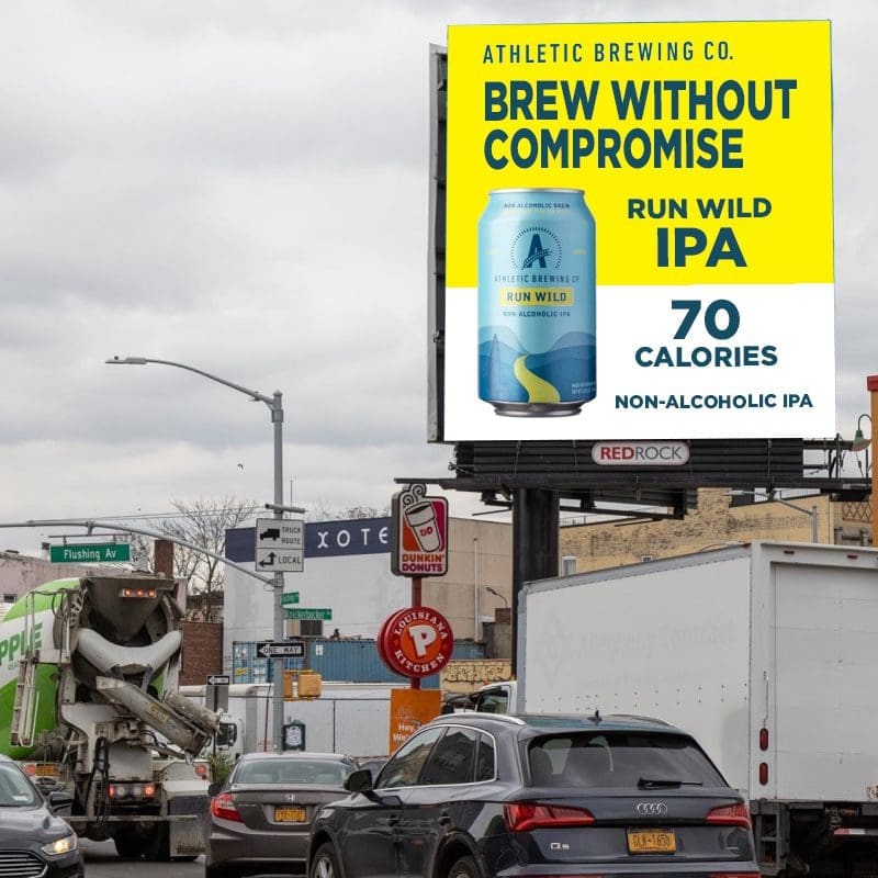
The small areas of yellow on the can open the possibility of something that will grab the target audience by the retinas and make them look. It also gives us better contrast for improved legibility. Eliminate the distraction of a tiny unexplained human figure with clean white space to contrast with the enlarged features and benefits.
[wpforms id=”9787″]
Paid Advertisement