Rate This Board allows a billboard designer to rate a random piece of billboard artwork using the following scale: 1 (not good), 2 (below average), 3 (average), 4 (very good), 5 (great). Then the designer talks about what they may have done differently for outdoor advertising. This week’s rating is provided by Greg Callaham www.gregcallaham.com) who has 30 years of experience in outdoor advertising design. Insider has used and endorses Callaham’s services.

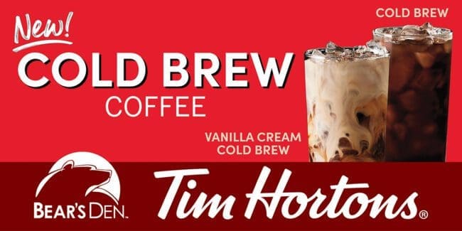
Cold Brew Coffee
Rating: 2 (below average)
- This billboard informs the target audience there is Cold Brew. Unfortunately, it may leave that audience wondering what else the board says.
- The overall ad is dark with the only high contrast of the words “Cold Brew” to draw the eye.
- There’s some bright area in one of the glasses, but we’ve had the luxury of looking at it for a while to figure out it’s a glass. The target audience is a hundred yards down the road by now still wondering what and where Cold Brew is.
- This is a nice, dramatic piece for a magazine ad when the target audience can hold the ad in their hand and study the photo and read the tiny words above the glasses and see the small logos at the bottom. But it falls a bit short for an effective outdoor ad. For those reasons, the board gets a 2 (below average).
Given the opportunity and based on the info at hand, I would encourage the advertiser to run something more like this:
[wpforms id=”9787″]
Paid Advertising









Thank you this help our creative dept. alot. Royal