Rate This Ad allows a billboard designer to rate a random piece of billboard artwork using the following scale: 1 (not good), 2 (below average), 3 (average), 4 (very good), 5 (great). Then the designer talks about what they may have done differently for outdoor advertising. This week’s rating is provided by Greg Callaham (www.gregcallaham.com) who has 30 years of experience in outdoor advertising design. Insider has used and endorses Callaham’s services.
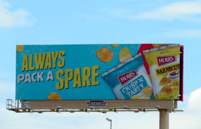
Herr’s Potato Chips
Rating: 4 (very good)
I’ll cut right to the chase. Nice job, Herr’s! This outdoor ad checks off the right boxes:
- Bright colors to draw the eye
- Large, easy-to-read headline
- Clearly communicated selling message
- Easily recognized product image
- All in less than seven words
I would have advocated for a background a little darker blue than the color on the bag to give the headline and bag more contrast. The different background behind the yellow bag is an excellent example. I also would have pushed for upper- and lowercase text in the headline for even easier reading.
This ad earns a solid 4 (very good).
[wpforms id=”9787″]
Paid Advertisement
