Rate This Board allows a billboard designer to rate a random piece of billboard artwork using the following scale: 1 (not good), 2 (below average), 3 (average), 4 (very good), 5 (great). Then the designer talks about what they may have done differently for outdoor advertising. This weeks rating is provided by Greg Callaham www.gregcallaham.com) who has 30 years of experience in outdoor advertising design. Insider has used and endorses Callaham’s services.
LIFEWTR
Rating: 5 (great)
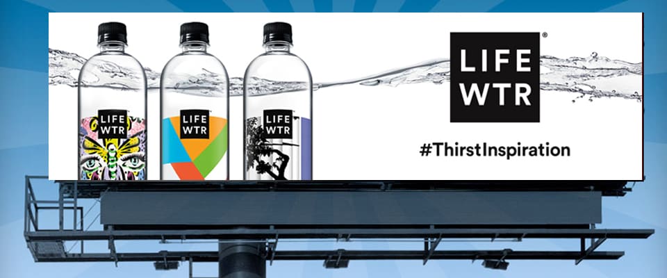
- This LifeWtr billboard does an excellent job of applying the KISS principle: Keep It Super Simple.
- The white background not only stands out against the sky day or night, but also gives the text and photography and terrific background for contrast. Contrast, my friends, dramatically increases the target market’s chances of reading and understanding the selling message.
- The bottles have unique colorful labeling.
- The logo is a simple black square with white text. The grey watery swoosh across the board visually emphasizes what we’re selling, leads the eye across the ad, shows the pureness of the product, and makes the background more aesthetically appealing without becoming a distraction.
- This strikes me as an outstanding example of an awareness ad. Chalk up a 5 (great).
[wpforms id=”9787″]
Paid Advertisement
